
“Thornberg & Forester, who were highly recommended by industry peers, really came through and exceeded our expectations. We commissioned their services and expertise to help us develop an extensive and robust motion gfx toolkit, in addition to a new logo animation, that will in a sense become the face of our brand, appearing everywhere, from theaters to streaming services, site and social. They are experienced, high-caliber creative talent with an insane attention to detail. One of the things that really set T&F apart from others is their ability to create beautifully designed and streamlined systems, and then the thoroughness and care to walk through how it all works. This team is incredibly collaborative, professional, organized, thoughtful and overall, just easy to talk to and kind. We really felt like they were an extension of our own creative team and understood all of our objectives — it was a great partnership, and because of that it’s become ongoing.”
– VP of Design & Creative, First Look Media
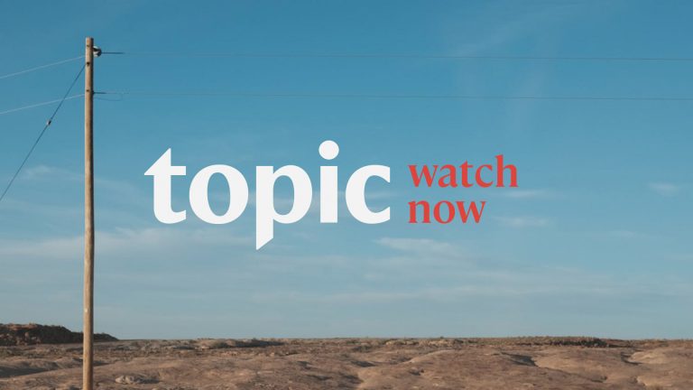
Topic is an ambitious new entertainment and storytelling studio from First Look Media, dedicated to working with creators at the forefront of culture. From Academy Award-winning films to television, audio, and digital, Topic explores a wide range of subject matter, both fiction and nonfiction, with an emphasis on stories of consequence.
Topic.com focuses efforts on visual and audio stories programmed around monthly themes. After working closely with Creative Director, Maggie Tsao on the Topic rebrand, Thornberg & Forester was engaged to design the motion package for Topic.com as well as their social and in-cinema experience. T&F also engineered a vast, comprehensive, and pixel-perfect motion toolkit, providing the Topic team with failsafe solutions to maximize production efficiencies while staying true to the integrity of their new brand.
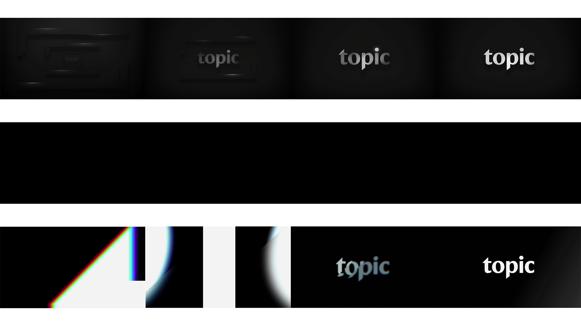
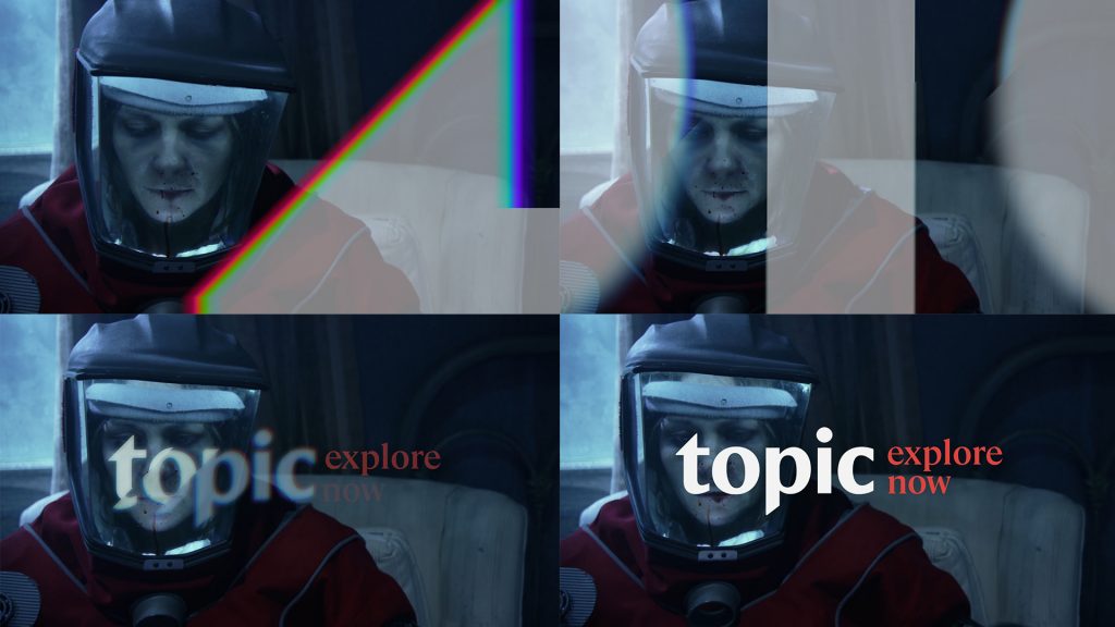
One of our many tasks was to design and craft the Topic films brand ID for cinema use. After months of development, we landed on the hero seven-second version above. Our brand story supports the art of filmmaking through the use of white light by representing the wavelengths of the visible spectrum, racking and pulling focus on detail, and bringing these elements together in a tasteful, designed manner. Additionally, we delivered five and three-second versions, both fullscreen and keyable for Topic.com use. We partnered with our great friend and supremely talented Joel Pickard to score the brand mnemonic.
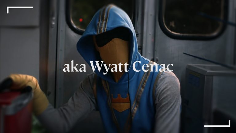
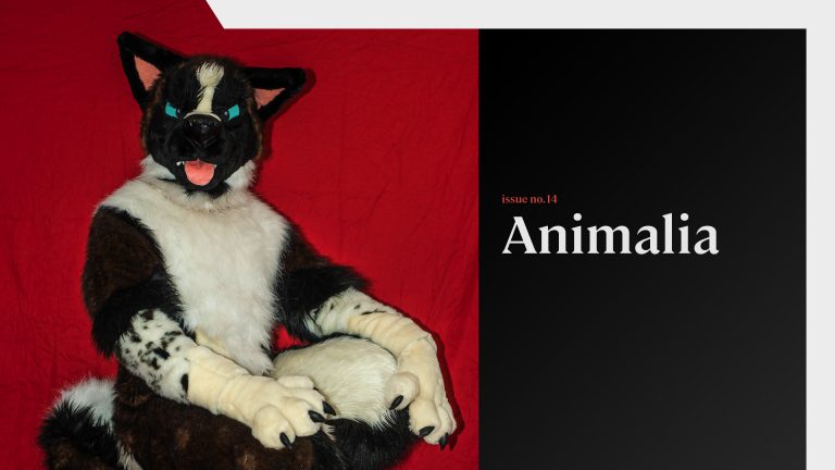
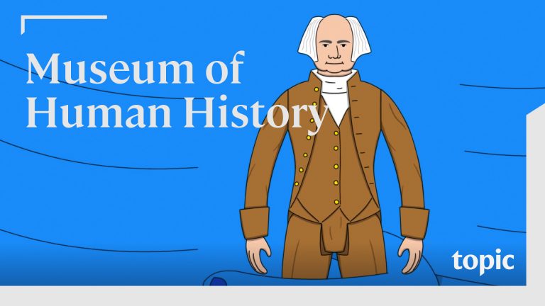
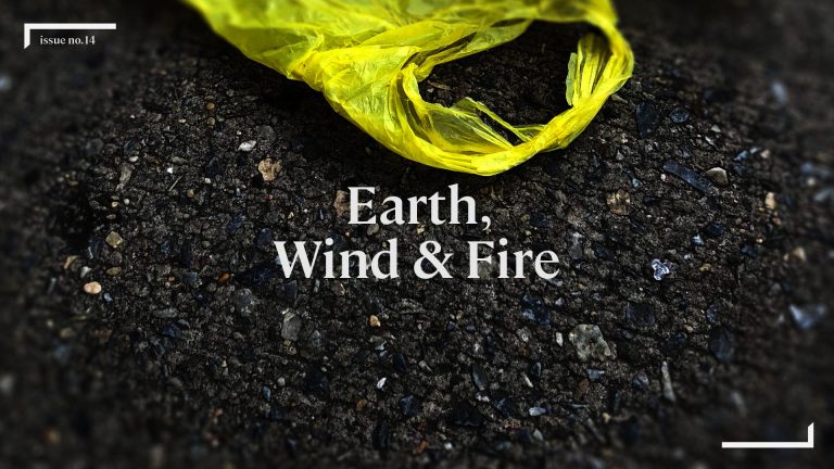
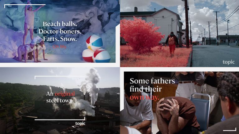
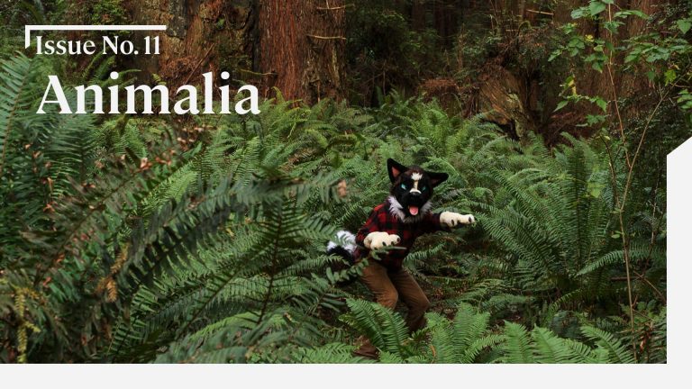
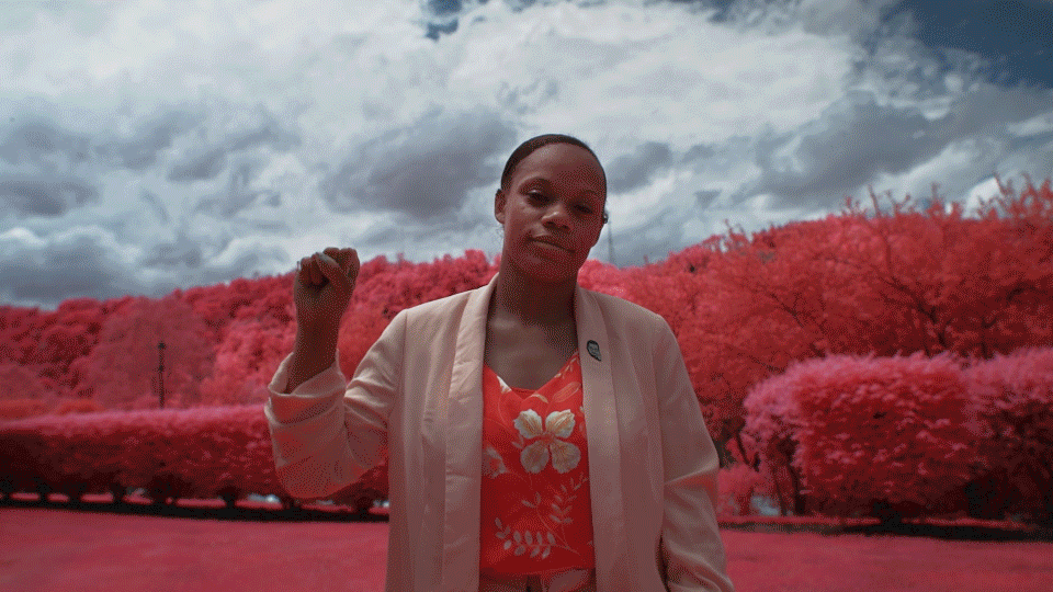
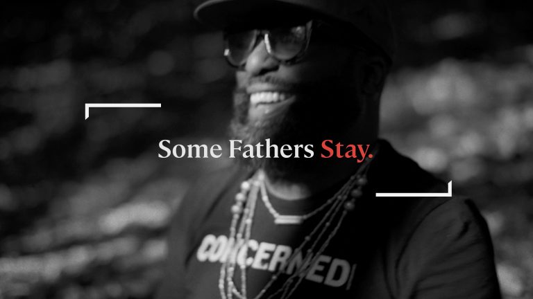
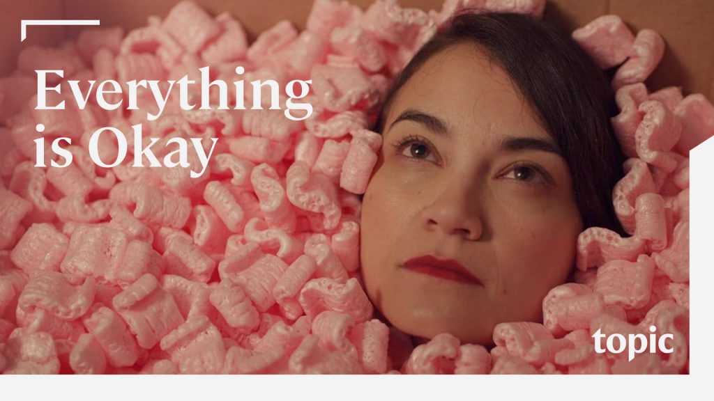
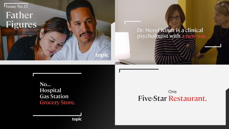
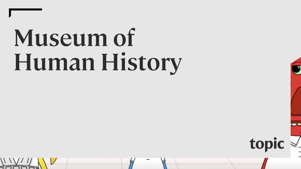
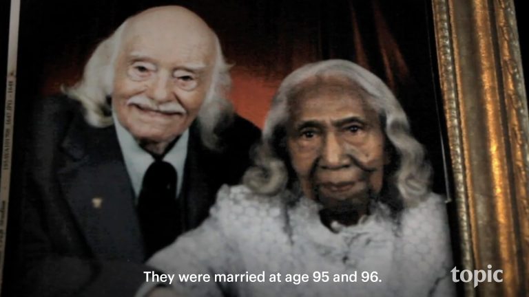
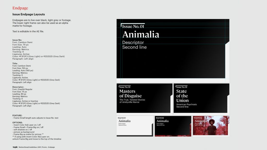
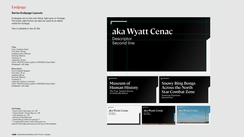
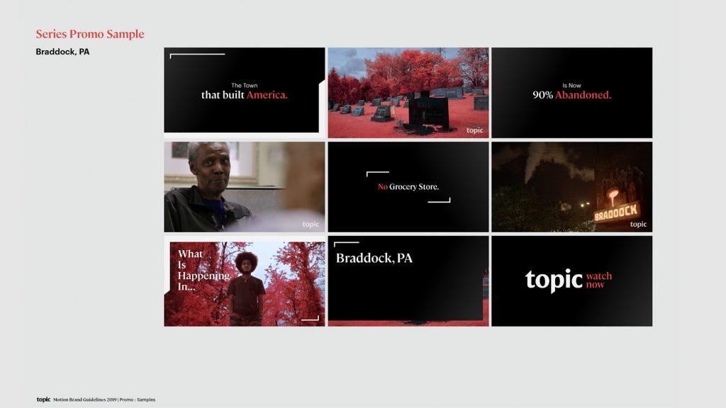
Topic.com is host to a variety of amazing content, for which, there are two buckets: Series and Issue. While these buckets showcase different forms of content, we designed each promo package to be similar but different enough to separate them while remaining unified from a branding perspective.
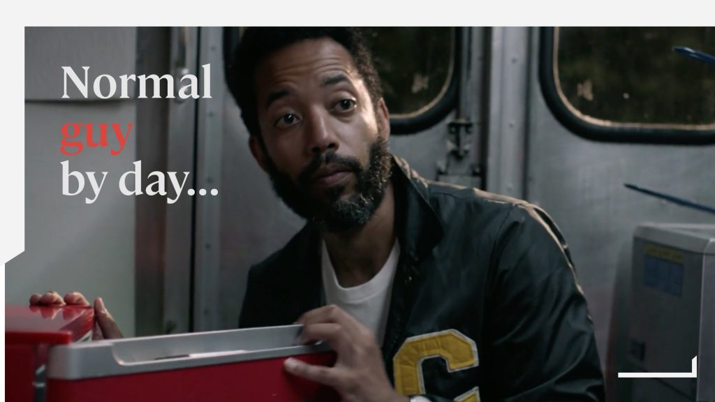
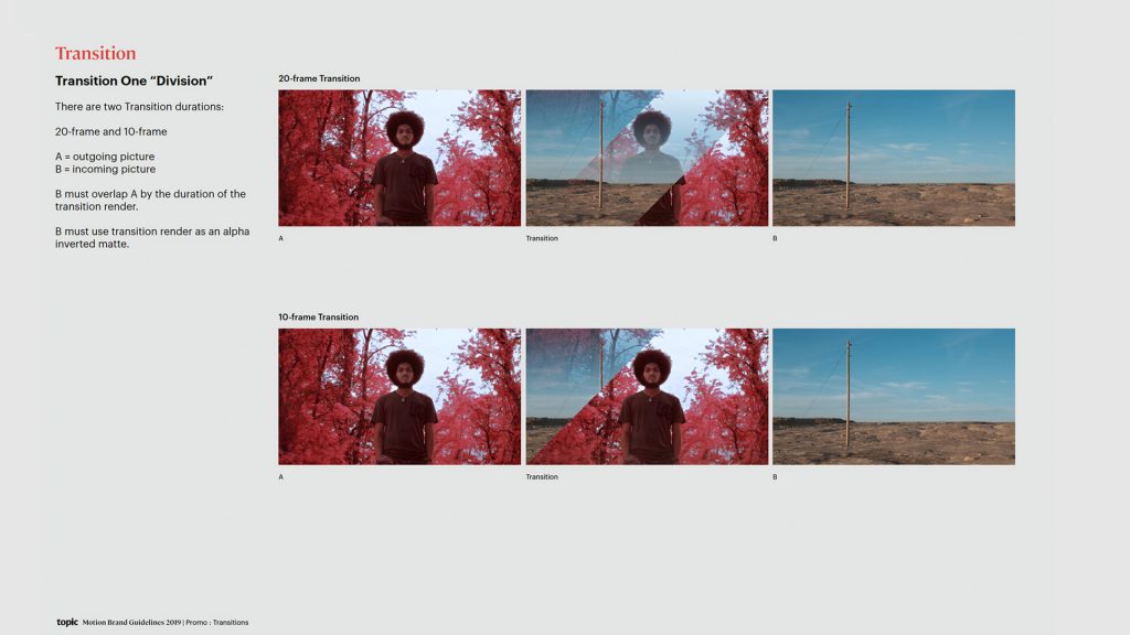
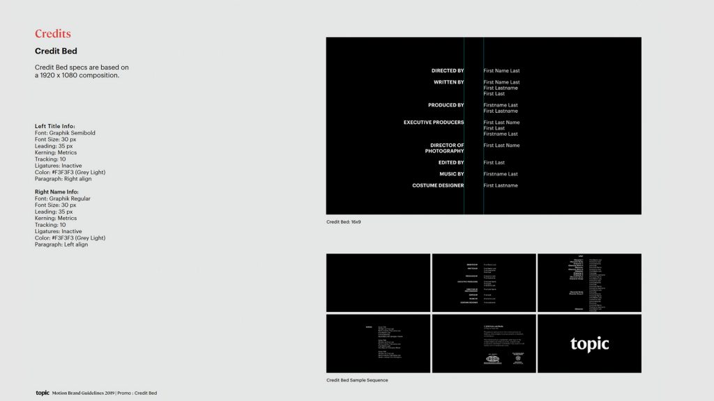
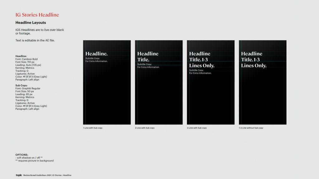
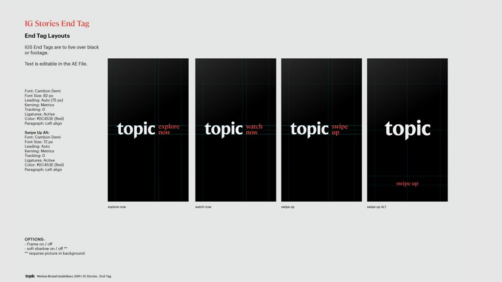
As promos are built in-house at Topic, not to mention the sheer quantity that must be produced on a daily basis, it was paramount for us to deliver the most streamlined toolkit possible. Our team authored solutions that do not rely on keyframes, but instead, just by sliding markers on individual project asset layers. This system was built out in robust form to work for transitions, lower thirds, endpages, titlecards, and all assets for social media (Instagram). Text color is changed with one click and respects dark and light backgrounds, for which subtle cast shadows deploy accordingly to ensure messaging is never lost.
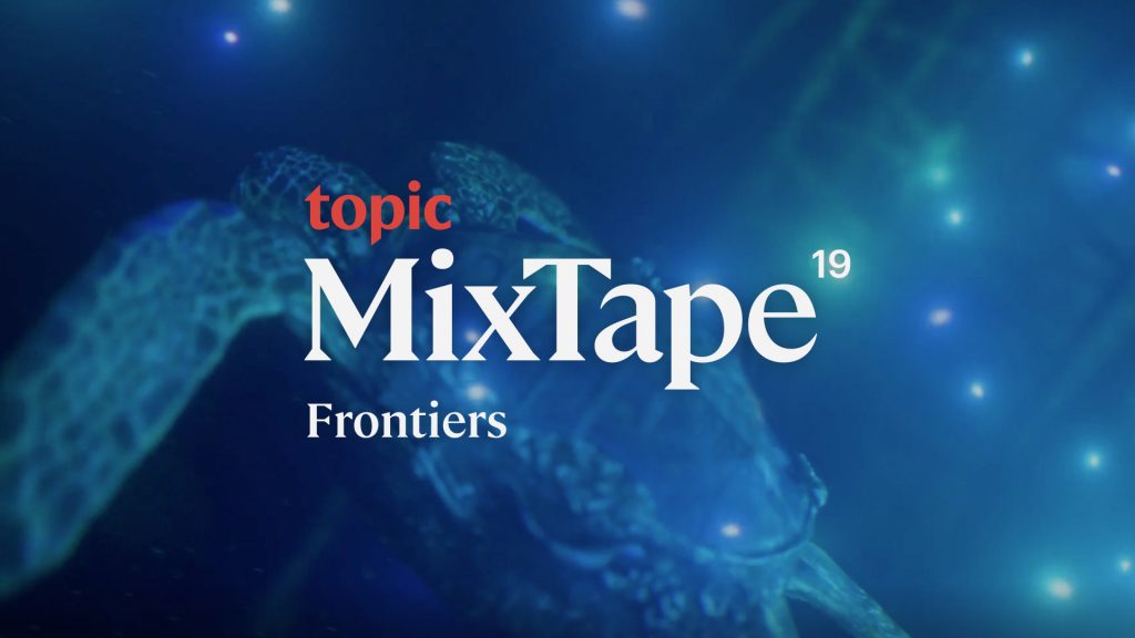
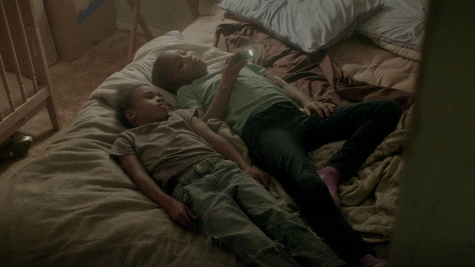
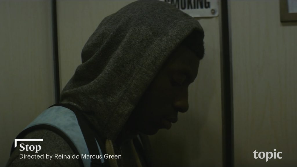
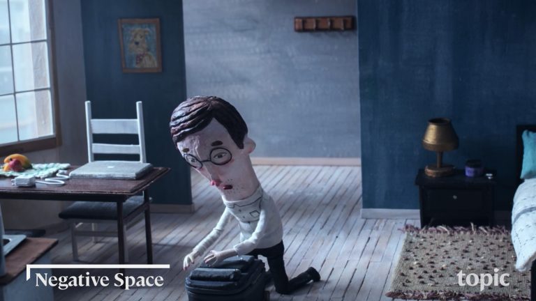
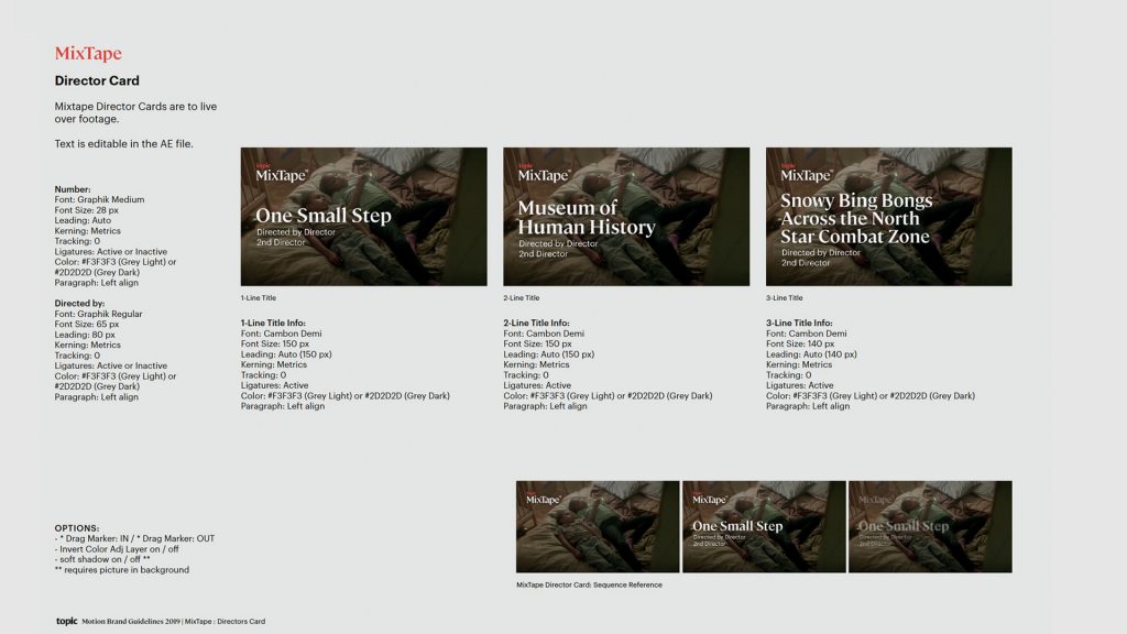
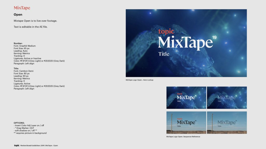
MixTape is an ongoing archive of films that is exponentially catalogued under the Topic.com umbrella. Each kicks off with a MixTape logo animation and cuts to a director card to tee up an individual film. Toolkitting for this element involved solving for one, two, and three-line titles and color way selection.
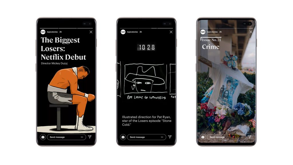
As with the Topic.com system, the titling, subtitling, and messaging system we designed for social embraces content as king. Text and graphics animate tastefully and never interfere with the visual story being told.
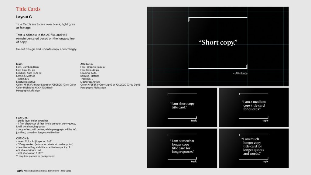
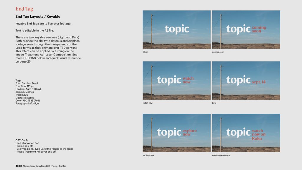
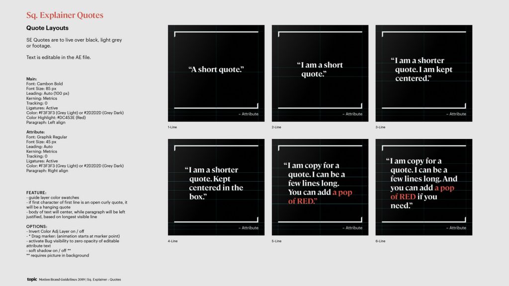
The entire ecosystem of elements (of which there are hundreds) lives on an architected grid system. Text, graphics, network bug, hanging quotes, etc…all have been painstakingly specced, sized, and positioned to co-exist in perfect harmony.
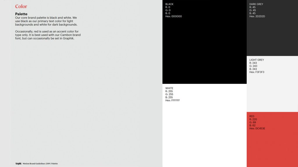
While our toolkit was engineered for users in a most intuitive way and geared to be as bullet-proof as possible, we also crafted a comprehensive Motion Brand Guildelines deck to ensure design and production integrity remain unscathed. The above selection of pages represent a sliver of what was delivered.