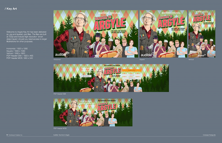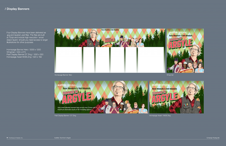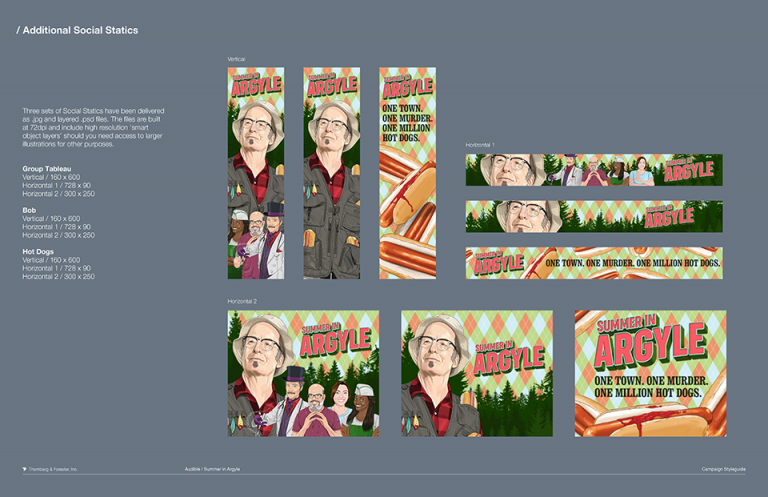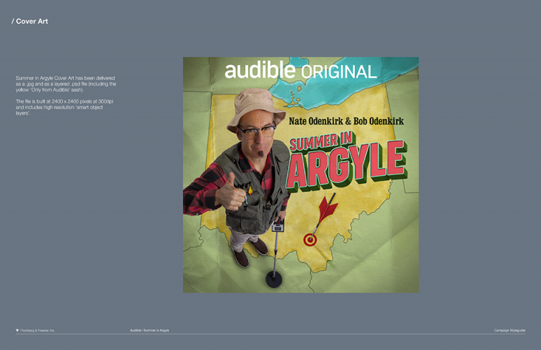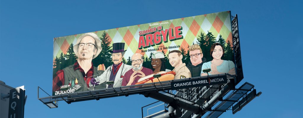

Our great friends at Audible invited us to manifest a visual world for one of their funniest (well, maybe second funniest) titles to date. ‘Summer in Argyle’ is a 10-episode comedy that was written by Nate Odenkirk, son of actor and comedian, Bob Odenkirk.
The story is based in rural 2013, Argyle, Ohio. A land where townsfolk don’t try too hard. Argyle is a place where second best is what residents strive for. The story is brilliantly delivered by an amazing cast of celebrity comedians; David Cross, Tim Robinson, Stephanie Courtney, Brian Posehn, Lyric Lewis, Carl Tart, Paul F. Tompkins, Jill Talley, (to name a few) and of course Bob Odenkirk, who guides listeners through each episode as soul patch sporting, metal detector wielding, Argyleite, Jeremy Zax.
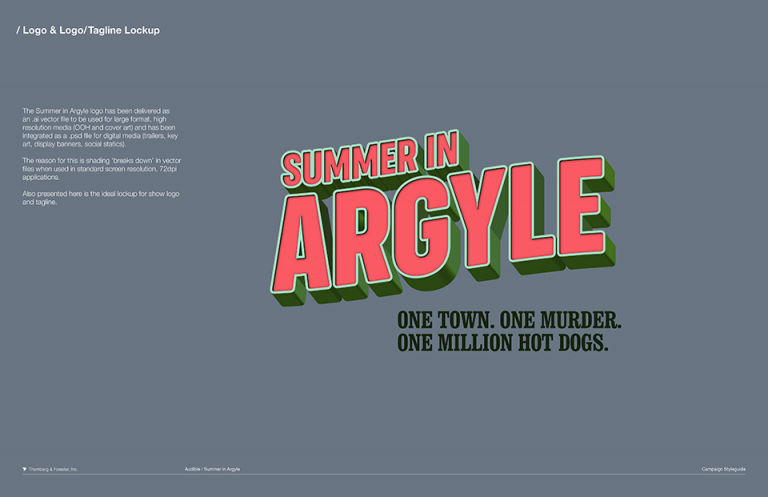
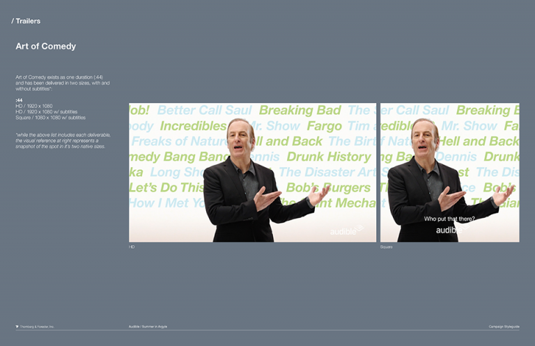
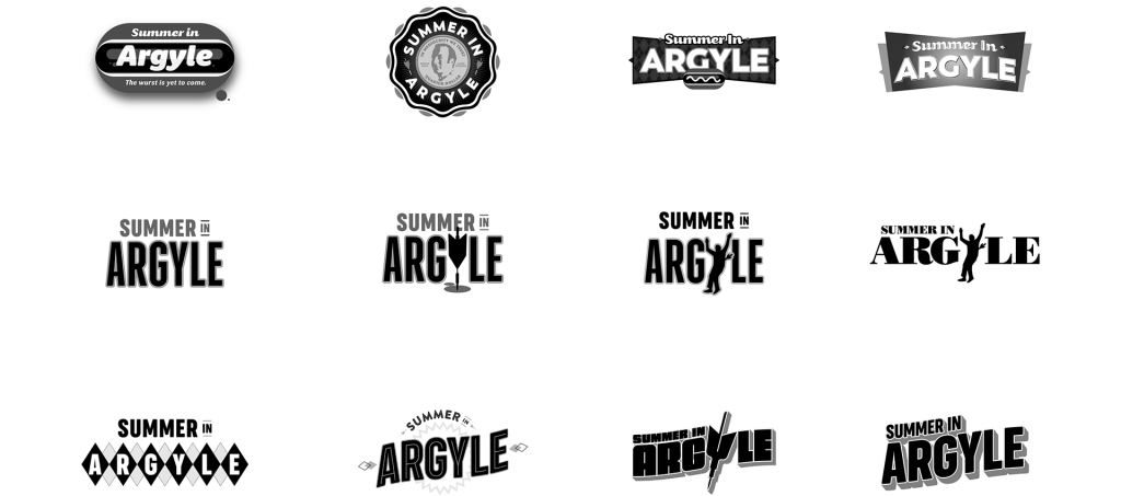
Deliverables for the campaign included logo design, copywriting, key art, full digital ecosystem of assets, live-action trailers, OOH billboards, animated vignettes for social, animation toolkit, and campaign styleguide.
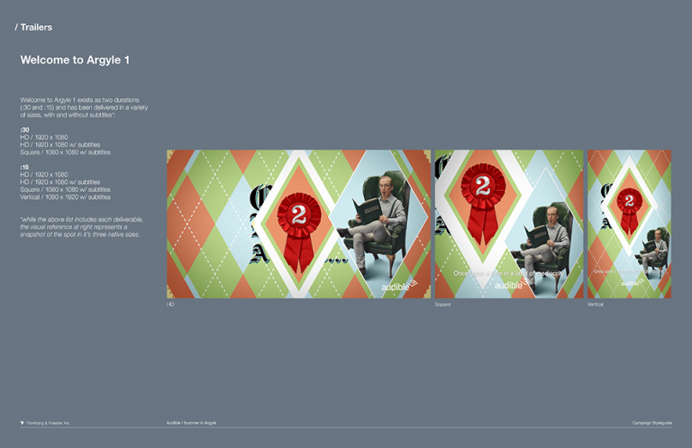
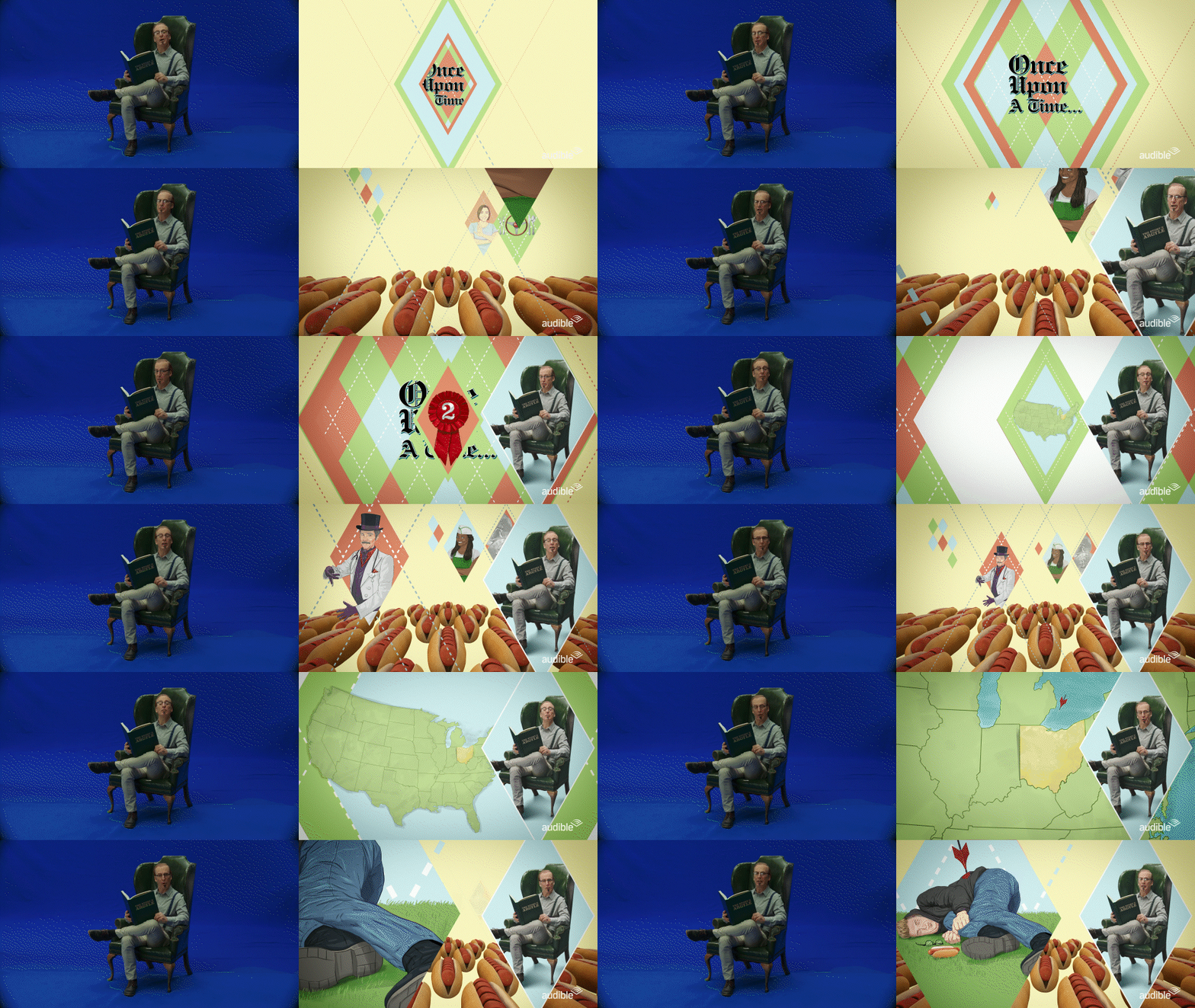
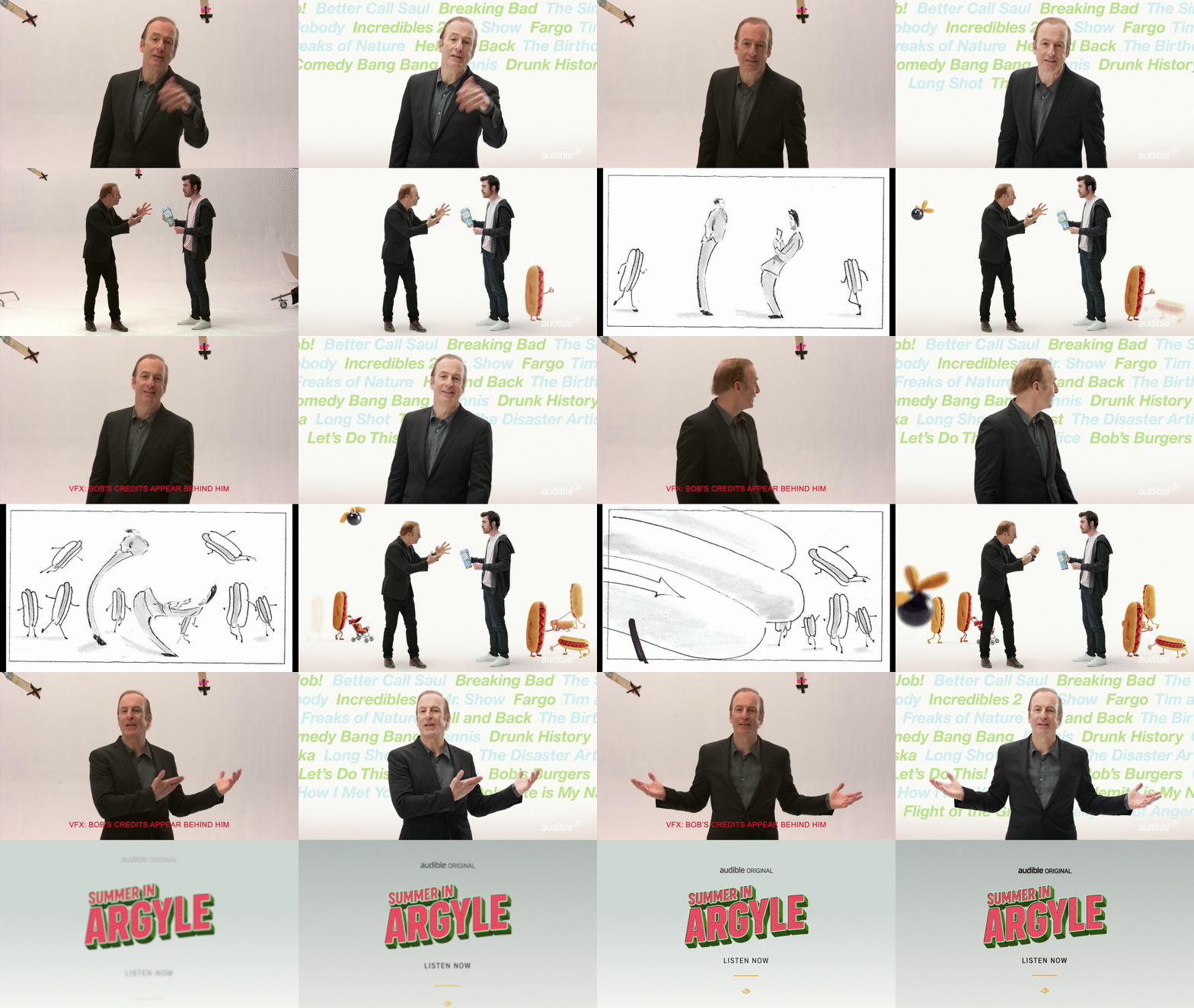
We pitched and sold the idea to the Odenkirks (and Audible) of positioning the launch trailers as low-fi, campy, Argyle, Ohio destination commercials, entitled ‘Welcome to Argyle.’ We designed a brand and look for the town, and wrote and refined scripts for two spots and cutdowns for each. Both involved a live-action shoot with Bob, in character, in Los Angeles. Spot one is set in ‘storytime’ form, where Mr. Odenkirk introduces us to the land of Argyle and tees up just enough of the story to let viewers know Summer in Argyle is a vibrant hot dog eating contest murder mystery comedy “with everything on it.”
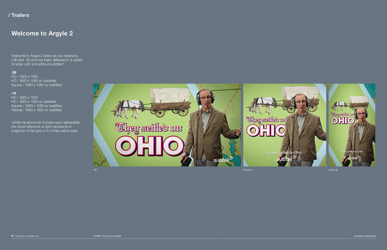
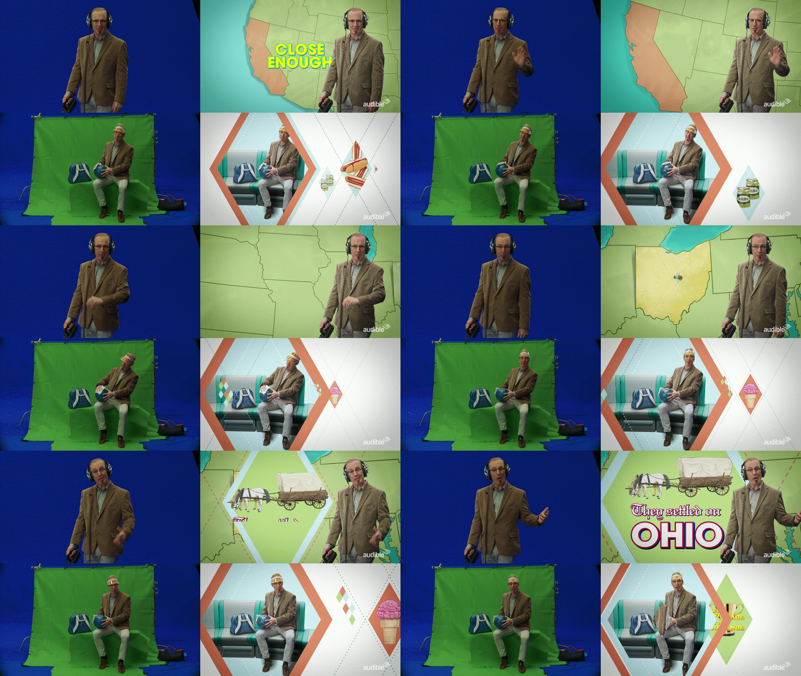
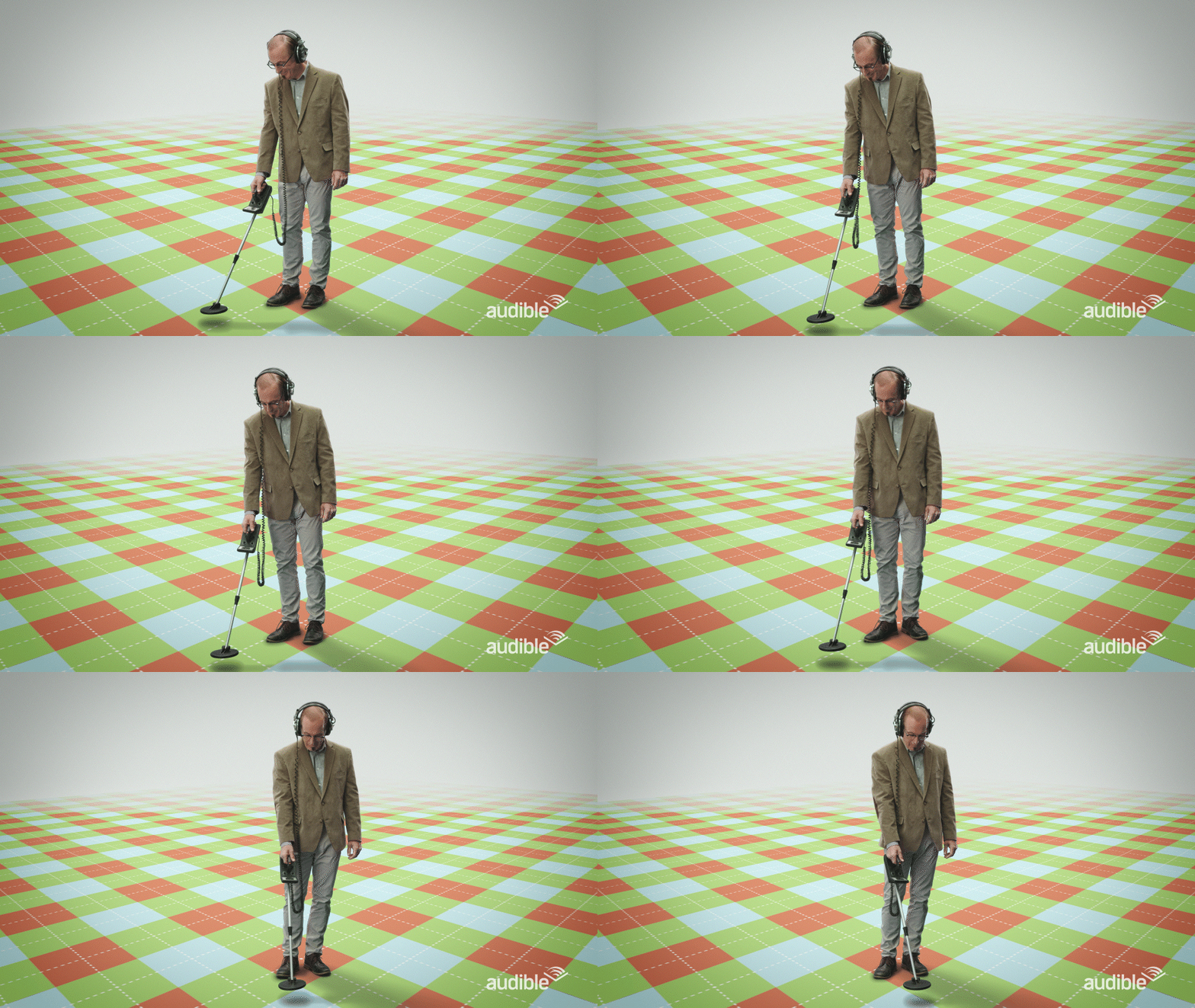
Welcome to Argyle 2, focuses more on the town of Argyle, letting viewers know that being “close enough” to winning anything in life, is what makes Argyle, Argyle. The no impact, low intensity sport of bowling plays a major role in the story, so we asked Mr. Odenkirk to toggle between searching for buried trinkets and to saddle up in bowling gear to help make the story shine…“but not too brightly.”
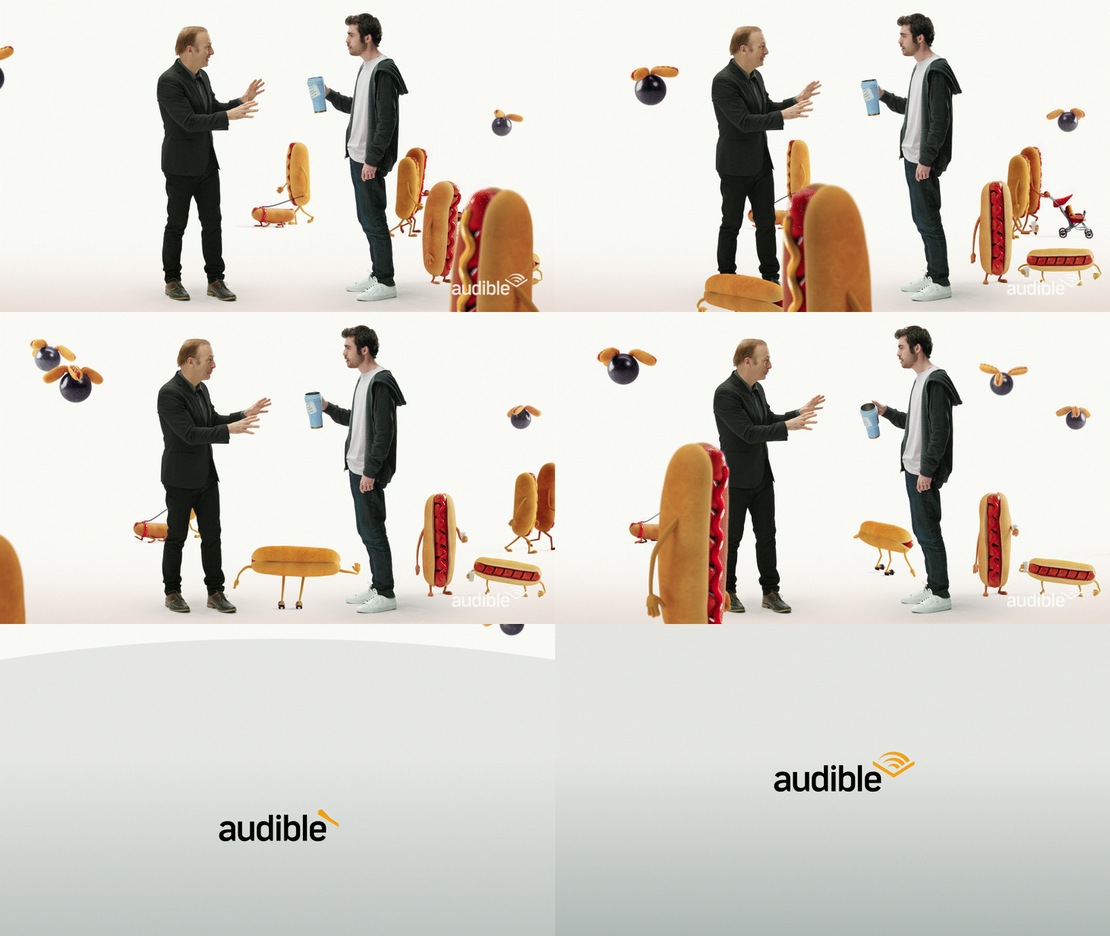
While our ‘Welcome to Argyle’ spots were selected to launch the series, we presented many other ideas and scripts for consideration. One was too hard to let go as we leveraged the fact that Summer in Argyle is truly a father and son life experience. Nate stumbles upon his dad’s organic ‘secret comedy sauce’ back stage and guzzles it right in front of him. He begins to hallucinate immediately and sees a world full of crazy hot dogs and flying bowling balls…all kernels of inspiration for conceiving ‘Summer in Argyle’.
The Odenkirk’s asked us to lean into “local cable access production value”, but to keep the spots smart and clever. Perfect, over-polished graphics, uber slick animation, and compositing are not things residents would expect to see in Argyle. Mr. Show (for cover art) and Tim and Eric (for hero trailers and fake social ads) were cited as inspiration for us (what a dream job this was!) We infused this thinking with hot dogs, bowling, lawn darts (the murder weapon), post cards, good ole Americana, and of course, lots and lots of argyle!
We worked closely with Bob to help define Jeremy’s look. Ultimately, we put together two sweet outfits that are all about comfort, not style. His look for key art is ‘fisherman/metal detector walkabout guy’ who sports bland khakis and a warm flannel beneath a technical vest that’s stuffed with hot dogs and fishing lures. The man is also wearing leather Skechers slip-ons! We initially proposed a handlebar mustache but Bob said during one of our zoom meetings, “No, no son, Jeremy needs a soul patch! He also needs one of those fisherman hats. And he’s got to be holding a metal detector!” We selected amazing photographer Justin Stephens to capture the perfect shot that would be used for key art and as a template for illustration reference.
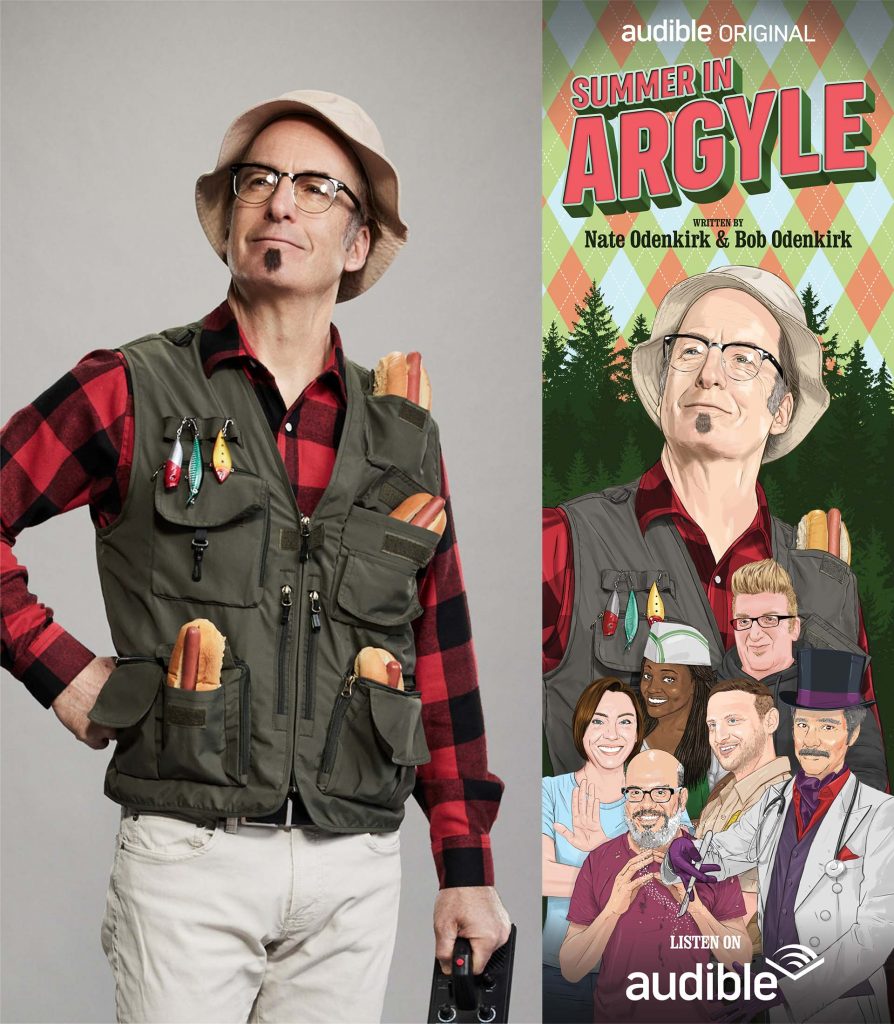
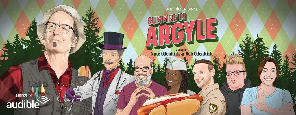
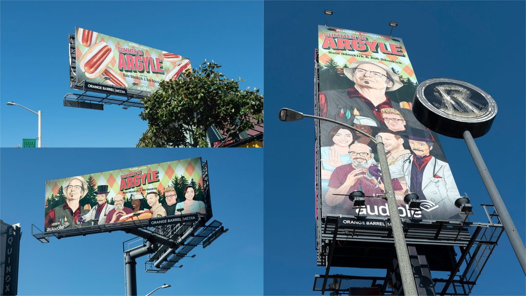
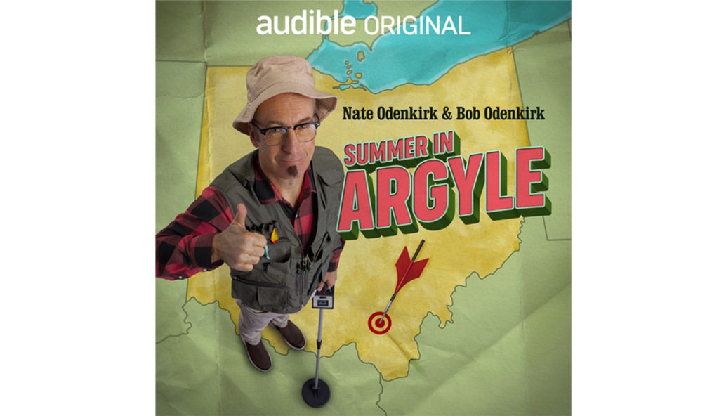
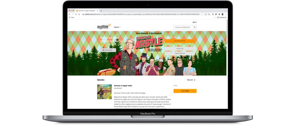
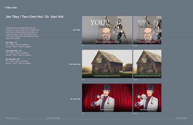
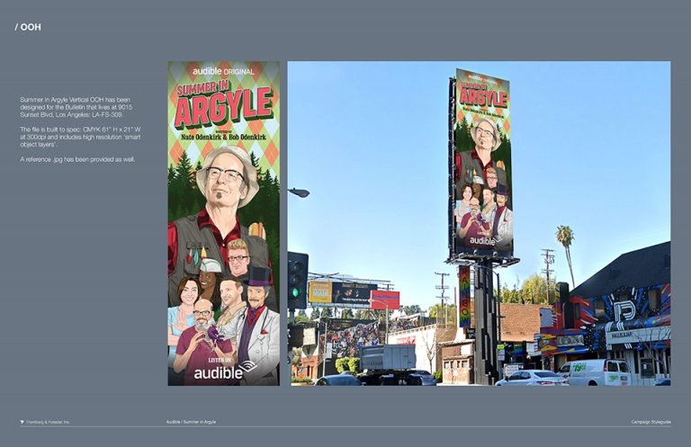
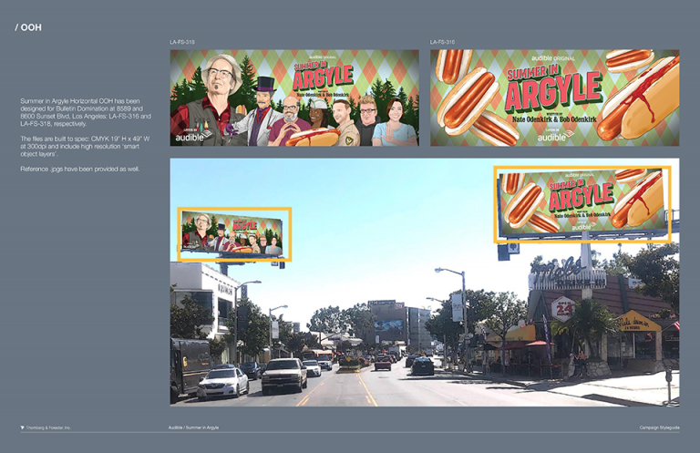
The Odenkirk’s latched onto the sketchy style of our early rounds of design. They felt it would be a really nice way to keep things unpolished, yet fun and inviting. We supplied brilliant designer and artist Vincent Diga, with photography selects from our shoot to illustrate Bob. Vincent nailed the likeness of six other featured celebrities from pulling reference and applying ‘costumes’ and body language that fit their character in the story. This illustration style was used for all assets in our Welcome to Argyle spots, for all digital media, and for OOH bulletins. We also produced three additional shorts for social channels where we lifted the audio from the actual show and manifested fake local ads that would be played in Argyle. These spots were also delivered in 1×1.
We chose to work with director Ben Orisich. Ben has vast experience with performance direction and unrivaled technical prowess, all through a highly trained eye of quality, integrity, and production value. We had very few hours to shoot three live action set-ups and two still photography setups. Thanks to line producer Anthony Hartman, all came together nicely and on schedule. Our art department did a fine job of sourcing, gathering, and making a handful of awesome props. We filmed on greenscreen, bluescreen, and a large white cyc. After knocking it out on stage, Bob and Nate walked over to a gray seamless set-up to be photographed by Justin. Once we locked our cuts, post involved a great deal of work; roto, 2D animation, 3D character previz and animation, compositing, color grading, finishing and package toolkitting. While our small army of specialists focused on each level of production, we also worked on producing full resolution art for three OOH bulletins.
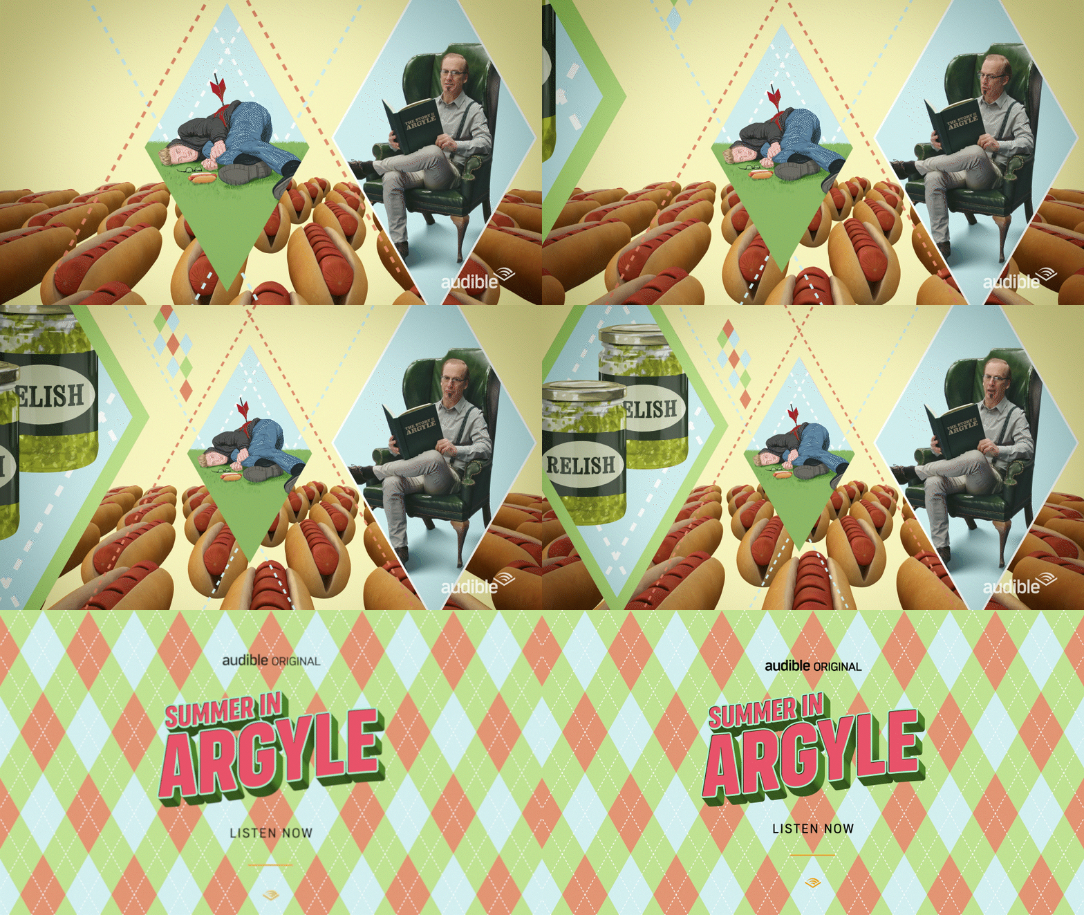
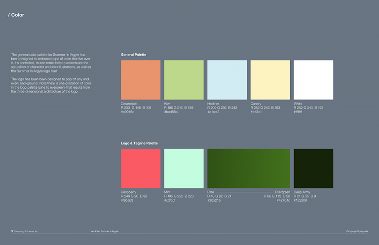
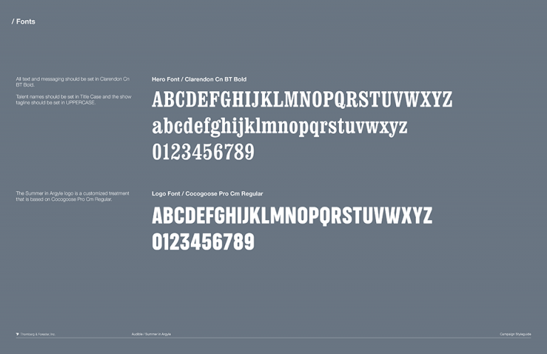
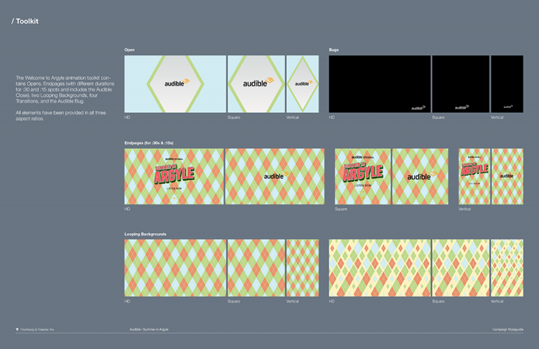
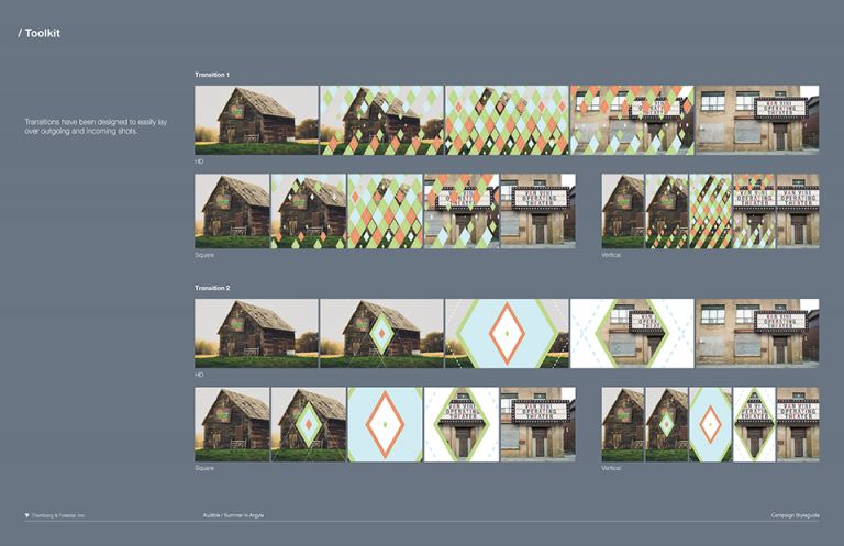
The icing on the cake (or relish on the hot dog) was arming Audible teams with the most efficient and effective tools possible to generate future, on-brand material. As always, our animation team engineered a smart and dynamic toolkit of elements for horizontal, vertical, and square formats, while our design team crafted a host of layered psd files for digital and print, and a comprehensive styleguide to ensure brand consistency and tone of voice for all things Summer in Argyle.
