Sezer Uysal is a global force in the world of progressive house music. Working out of Istanbul, he achieved fast success in 2010 when his track “Singing in the Bathtub” held the top spot on Beatport’s Deep House Chart for three weeks. Since then, more chart success has followed, as well as performances in over 45 countries and collaborations with countless major names in electronic dance music. A deeply intuitive artist, Sezer’s first loves will always be producing tracks and performing. But his desire to push his art forward has led to expanded creative endeavors – most notably the launch of his label and music platform, Theory X.
Uysal reached out to Thornberg & Forester at an extremely exciting time in his career. As Theory X is expanding rapidly, Sezer is also taking the time to refocus on his personal brand – opening a world of design opportunities. Our engagement was two-fold – one, design a fresh, new Sezer Uysal wordmark + Brand ID animation, and two, design and produce a Brand ID animation for Theory X (see case study). Each Brand ID would be crafted as an infinite loop to be projected behind Sezer and other Theory X deejays at live events.
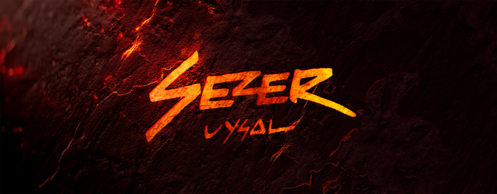
The new Sezer Uysal wordmark was designed to stand out. We wanted to develop a mark that felt different from what everyone else was doing. The hand-drawn quality is a bit of a departure for the electronic music space. We’re used to futurism, tech, and robots – this mark is much more visceral and organic. It feels primal, but does not feel antiquated. It evokes street art in a way that doesn’t feel heavy-handed, and has a dynamic energy that feels appropriate for a party.
Our hero logo animation plays up the raw and organic nature of the mark, setting a vibe that feels like ancient magic and primal human energy. We find ourselves in a dark cave deep within the earth. Vivid lights illuminate the walls, as traces of alien minerals flicker back at us. The warm glow of the lights reveals the work of (presumably) human hands – ancient carvings, cracked but well-preserved. Ultimately a wide shot reveals the Sezer Uysal wordmark inset in the rock. Dance music brings people together, and the logo animation reinforces this theme of timeless human connection. The mark feels like it has been deep within the earth for millennia, but also feels like a beacon leading us to a brighter future. For presentation purposes, we have included the Sezer Uysal remix ‘Herneise’.
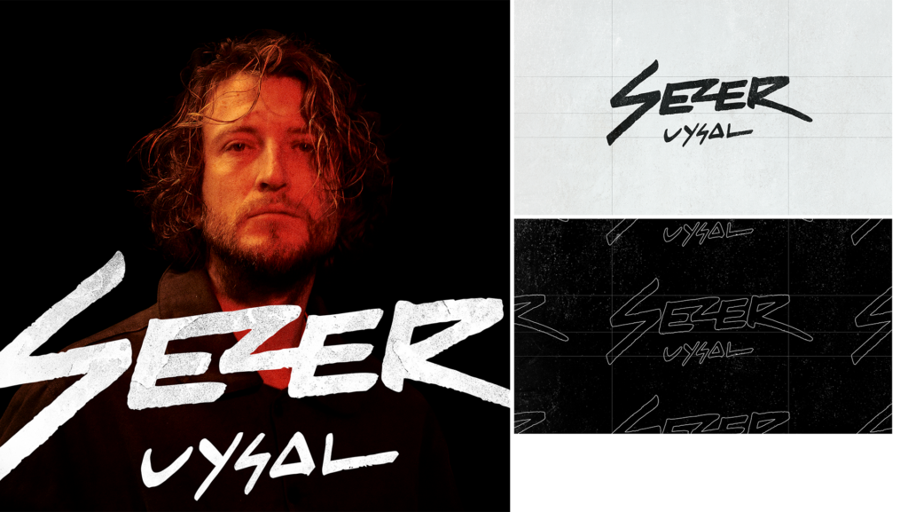
For versatility of application, the animation was designed to work in horizontal, vertical, and square formats. We developed a long sequence that can be edited down for an intro or outro, used as a one-off animation, or held as an infinite loop. In addition to the hero, full-color version, we also developed a black and white version for an edgier vibe.
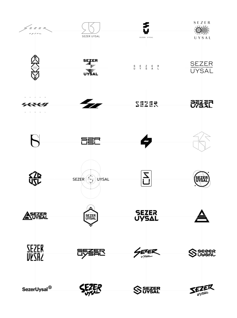
The logo exploration process was challenging and extremely enjoyable. With a clear goal to design a mark that would stand out from hundred’s of other artists, we had vast creative territory to explore. Our purpose was singular but our scope was huge. We explored Sezer marks that looked like alien alphabets, and understated typography inspired by modern fashion design. We explored marks that draw from house music’s rich visual history, reinterpreting it with a modern twist. We explored marks that looked like futuristic architecture, abstract marks that stretched the limits of legibility, and ultra-minimal marks that tested how simple we could go. In the end, designing a mark for a fellow creator is a tall order. It’s not just a case of expressing brand values or communicating messaging to an audience, the real challenge is to create a mark that speaks from the artist’s soul.
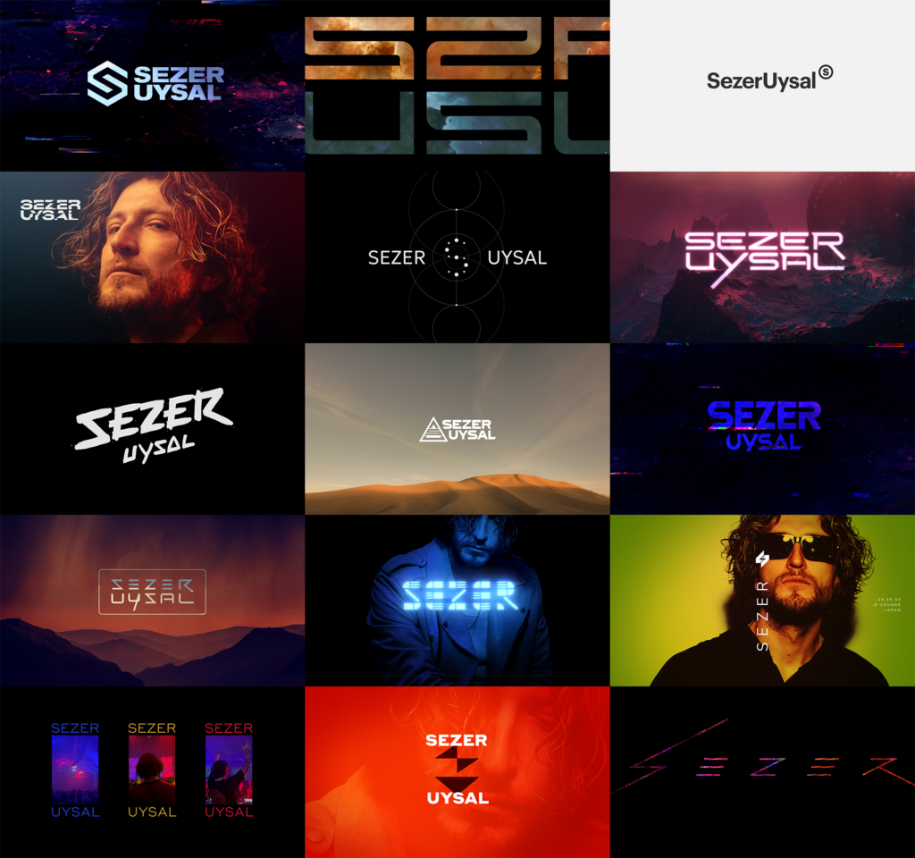
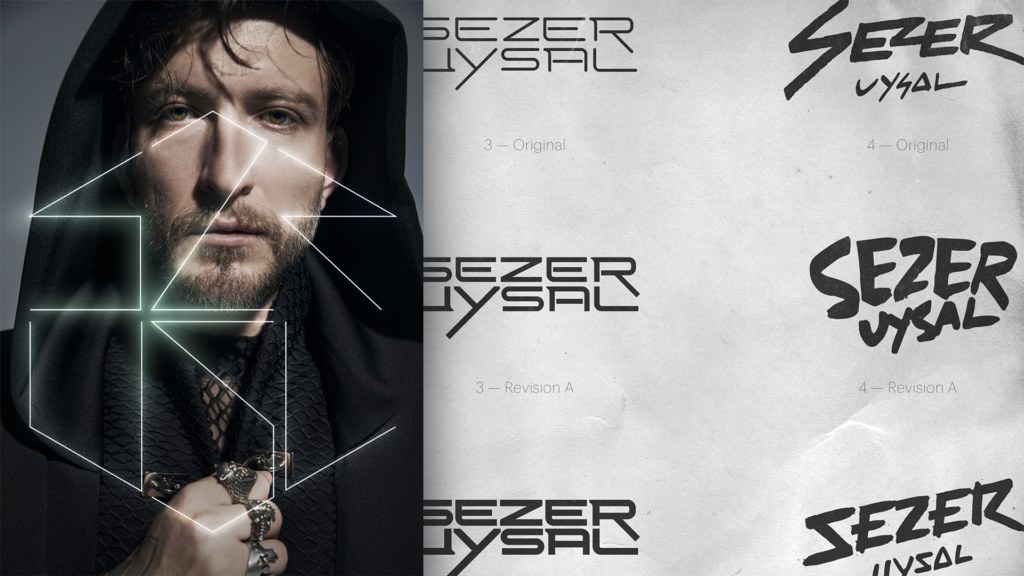
Throughout our exploration we created proof-of-concept mockups to give a sense of what the mark could look like in application. Contemporary media moves with a speed that drives an exponential rate of engagment, and modern technology allows us to create content faster than ever before. We really wanted to make sure that Sezer could see the full potential for what we could create once the selected logo was put to use.
The creative process at Thornberg & Forester is rooted in classic principles of graphic design. We needed to create a unique mark that would [also] work nicely in black and white application, and would remain legible at small scale. Our brand work for Sezer was scrutinized from all angles, ensuring the final mark would be easy to apply from a technical standpoint, and easy to adapt to different tones of voice, while retaining strong, authentic personality.