
After teaming up with us on 2013’s How the Economic Machine Works, (over five million views and counting!) Ray Dalio came back to us in order to execute a companion piece for Ray Dalio’s New York Times #1 Bestseller Principles: Life & Work. In partnership with Ray and a team from IDEO, who did excellent work mapping out and defining an action-adventure tale around the lessons in the book, we began to define the visual language and animation style for the eight-part mini-series. Over time, the story of a hero’s journey emerges in which we follow the protagonist traversing a precipitous mountain range, navigating a wild and rocky river, and crossing a jungle filled with dangerous predators emerges. Through this, our Hero, alone at first, and later joined by a team of colleagues, learns lessons about how to best navigate the world and seek goals in order to have a successful life.
Click here to view Episode One of Principles for Success.

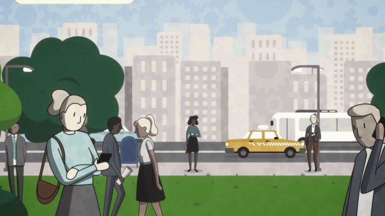
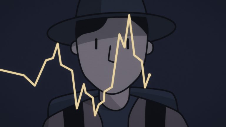
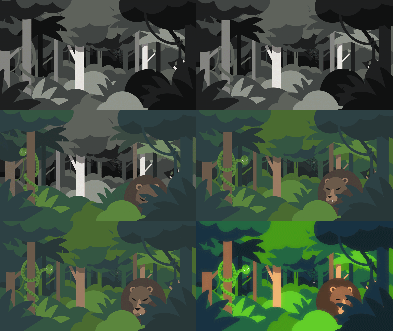
As with any project, large or small, our first step is to start building a framework around the challenge at hand in order to break it down into discrete pieces that we can attack. Thanks to the excellent roadmap architected by Ray and IDEO, we had a strong understanding of what we needed to communicate and what the elements were necessary for each scene. Our next step was a survey of the entire film to find the characters, backdrops, and actions that would crop up repeatedly. Our Hero was an obvious design point, as well as jungle and mountainous environments in which he would live, as well as a more spartan, educational space in which to illustrate abstract ideas.
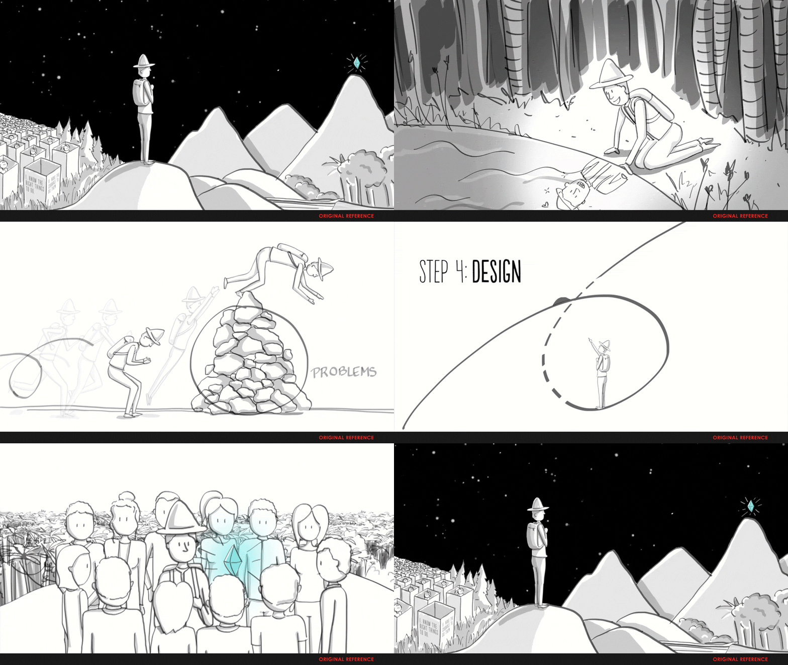
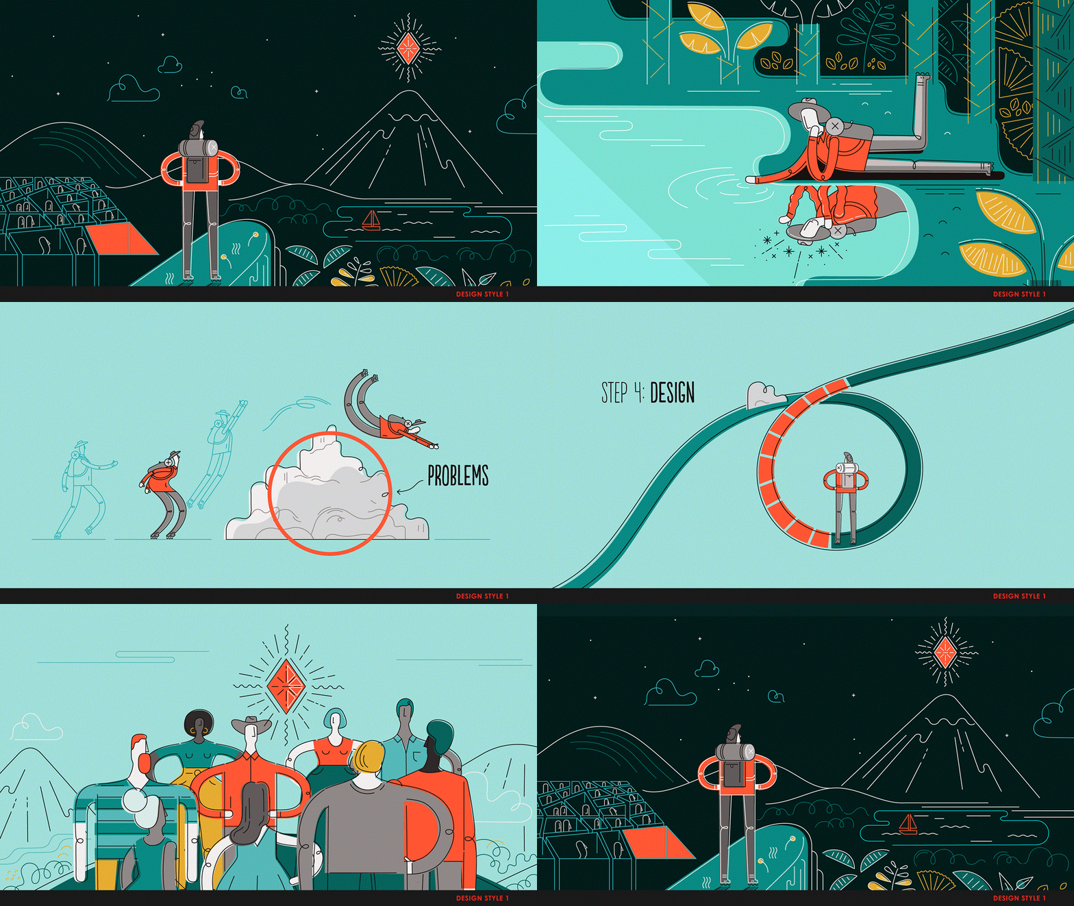
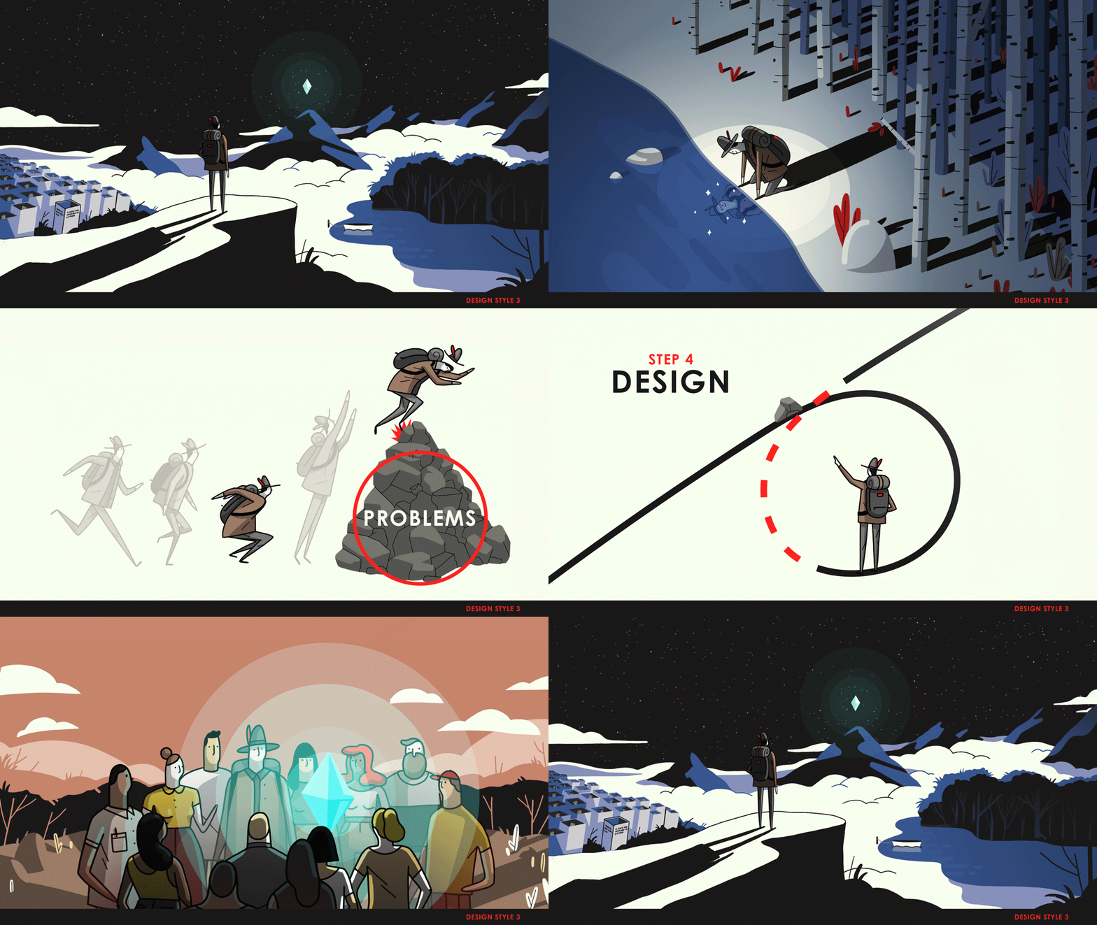
From this we identified five frames from the original storyboards to build our designs around. The goal then was to illustrate a range of looks that could be hung on this framework: designs that were fitting to the storytelling, while also elevating the understanding of the content, as well as being practical in the world of animation. The results were radically different; going from whimsical, brilliant color, to muted colors in a dynamic graphic space, to somewhat of a middle ground, developed from The Economic Machine’s style. Below you’ll find three of our executions, as well as the original storyboards from which they were derived.
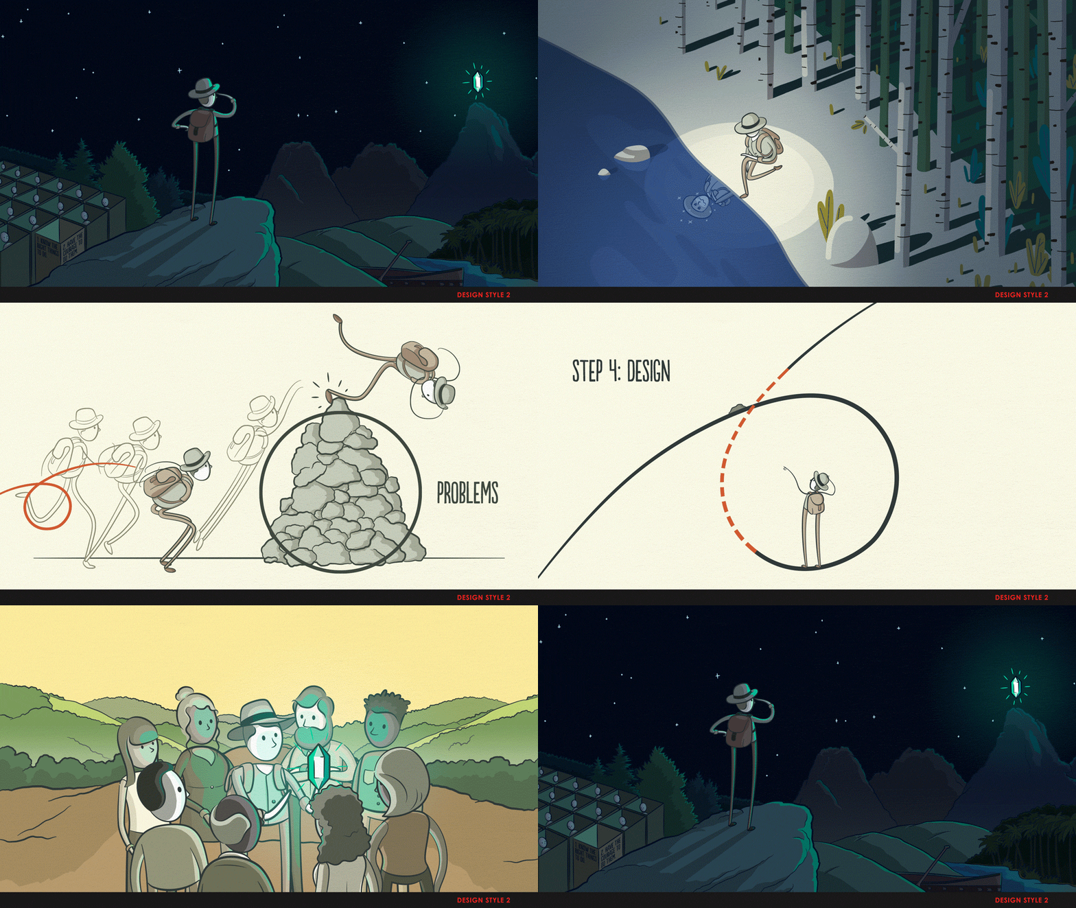
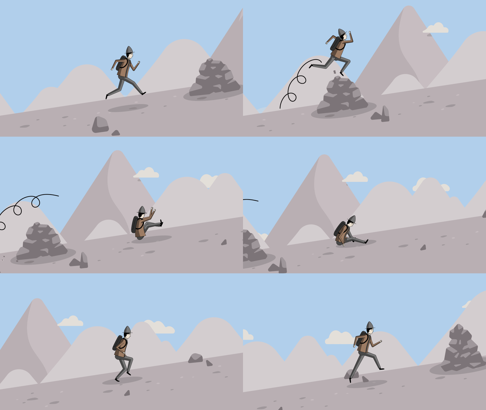
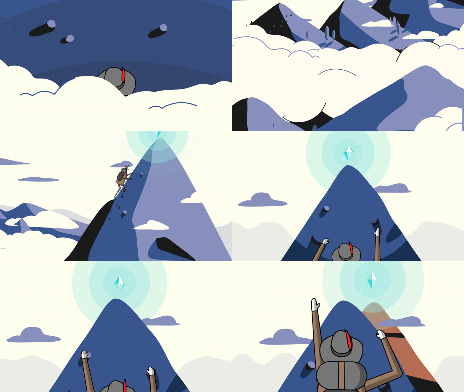
With the blessing of the third direction above, we began testing on the flexibility of the design over time. Character rigs were built and sections of episodes three and four were visualized so that a variety of environments could be animated to work with the character. Along the way, we began pushing the boundaries of the level of detail necessary to tell the story properly. Below you’ll see extreme parallax, wind whipping through feathers in the Hero’s hat, and rocks being disturbed by impacts from the character. Through this process, we were able to find out for ourselves, and demonstrate to Ray and team, the level of detail in both design and animation that gave us the best result and set us on the path to a more informed redesign process, where the narrative was the star.

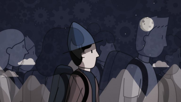
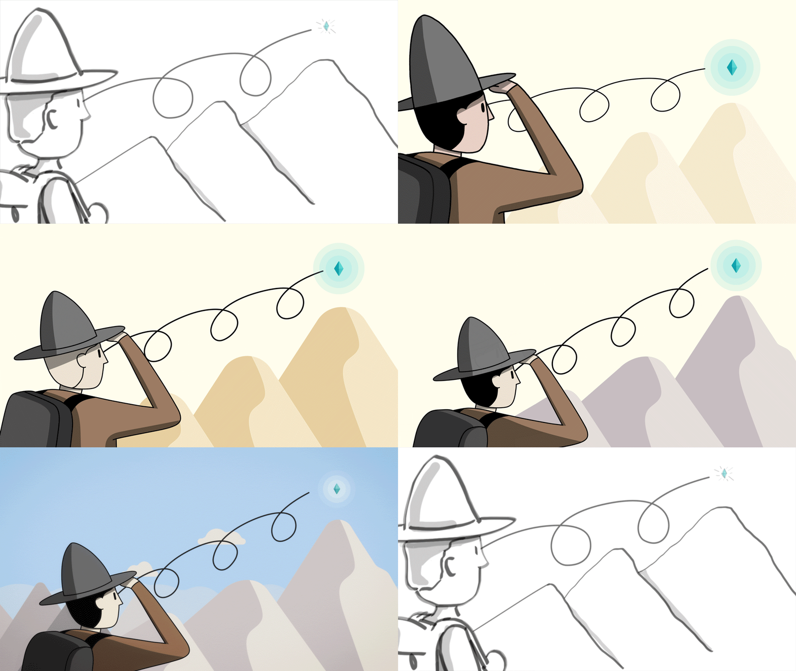
After experiencing the script and the artwork working together side by side, we took a step back to revise our design solution. What we were looking for was a style that had the muted colors and graphic nature of the original look, but with a slimmer profile… both in terms of the character’s silhouette as well as the level of detail in each composition. Another directive was to find a solution that brings the illustrations closer to reality, and breaks from some of the fantastical details, such as the Hero’s profile and mannerisms.
This took us along the path that stripped away a significant amount of detail of the Hero’s attire. Gone is the father of the hat, the excessive zippers and bedroll of his pack, and the bulky, winter weight of his coat. His head and body were slimmed down and brought to more realistic proportions for greater audience relatability.
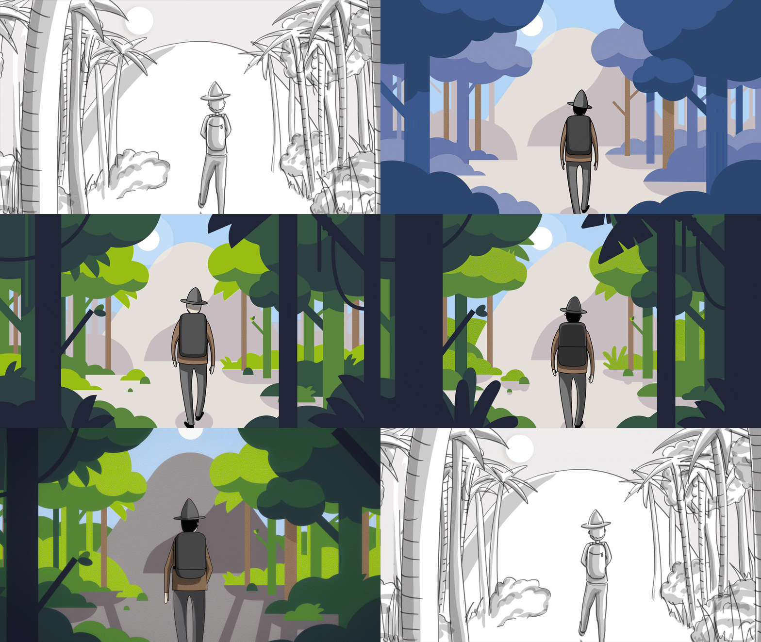
Meanwhile, a similar process was taking place with the environmental design. The forest began to take on the qualities of a semi-tropical jungle and the contrast in the layers of color was dialed in to fine the right balance between graphic and realistic. Mountains were stripped of unnecessary detail, and brought back into the real world with sky and clouds that cast shadows, anchoring the story in the world we know.
Having firmly established the language of the world, now it was time to apply these lessons to the film as a whole. The scope of the remaining design work left to do was staggering… there was a whole crew of the Hero’s colleagues, met along the journey, left to create. We needed to demonstrate the creation of the known cosmos and travel from there all the way down to the individual level. Complex river deltas needed to be navigated by the Hero and ourselves, and the denizens that fill out these created worlds needed to be brought to life. And eventually all of this had to be strung together cleverly in order to keep the rapid pace of the narrative running smoothly, necessitating new and unexpected transitional devices to be invented. The world of Principles is vast, but taken together feels like a cohesive and properly variant set of environments to demonstrate an arduous journey.
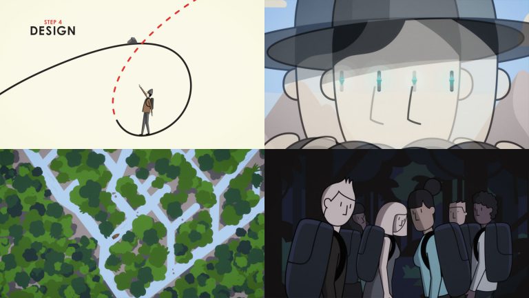


Our Hero character needed to be able to stand up to the ruggedness of the reality we created for him. In order to do this effectively, no single method of animation would be able to encompass the needs of the story. Multiple robust rigs were built for the Hero himself, including simplified versions from the front, back, and sides, as well as a few isolated head rigs to bring emotive expression to close up shots. However there are individual cases that required individual solutions, and our talented team displayed adaptability by branching into cell animation, basic IK puppetting, method acting, and brute force as needed.
On a very basic level, all animation is simply acting-at-a-distance provided by an animator. At multiple points in the day throughout this process, you could find animators and directors relearning how to walk, or demonstrating best canoe technique. With a hero designed so simply, the impact of body language was key to demonstrating emotion to underscore the lessons being taught by Ray’s VO. The variety of techniques used, and the multiple actors in the form of our animators allowed us to create a hero with a full range of emotions that could teach as well as he could fail and succeed.

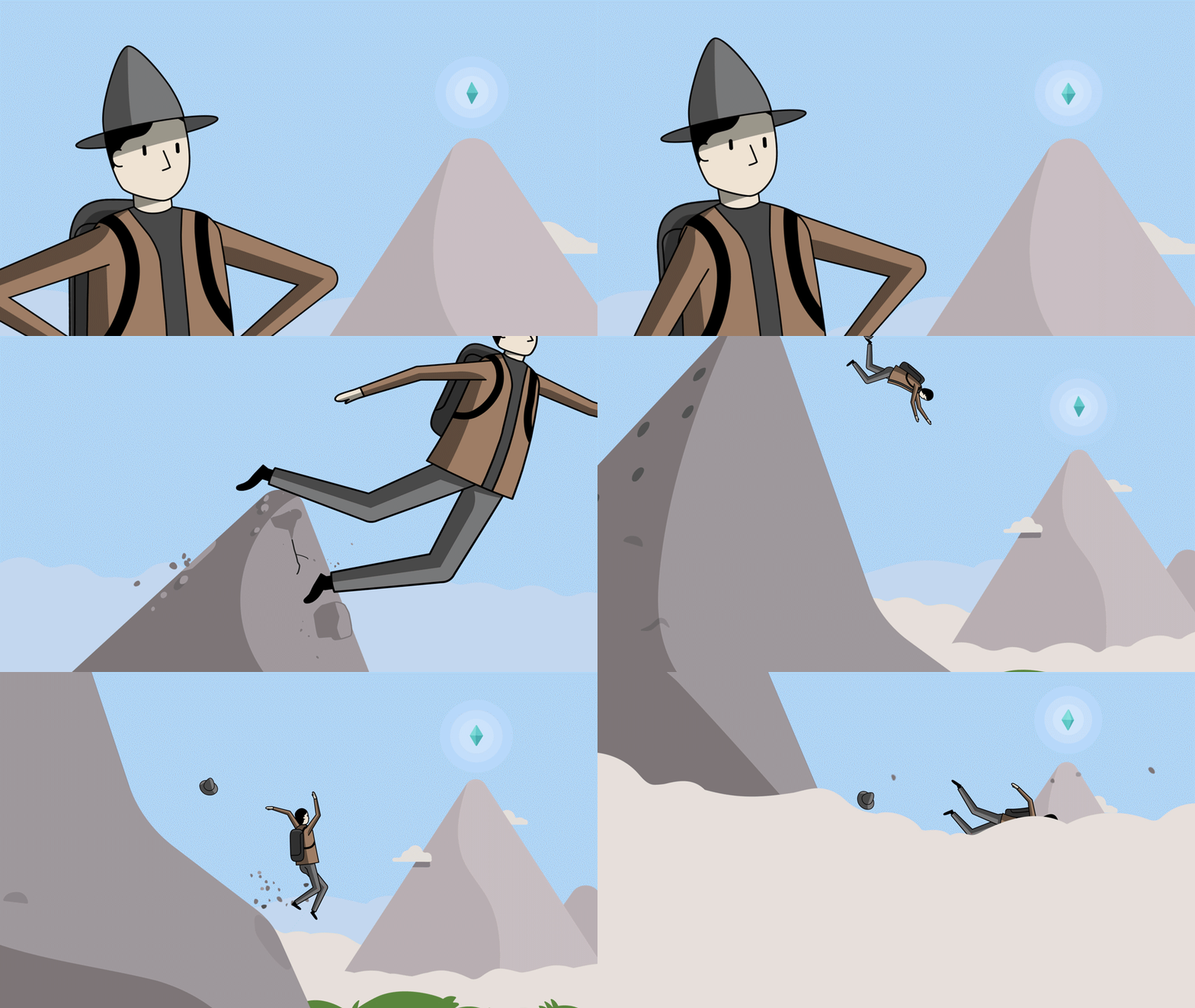
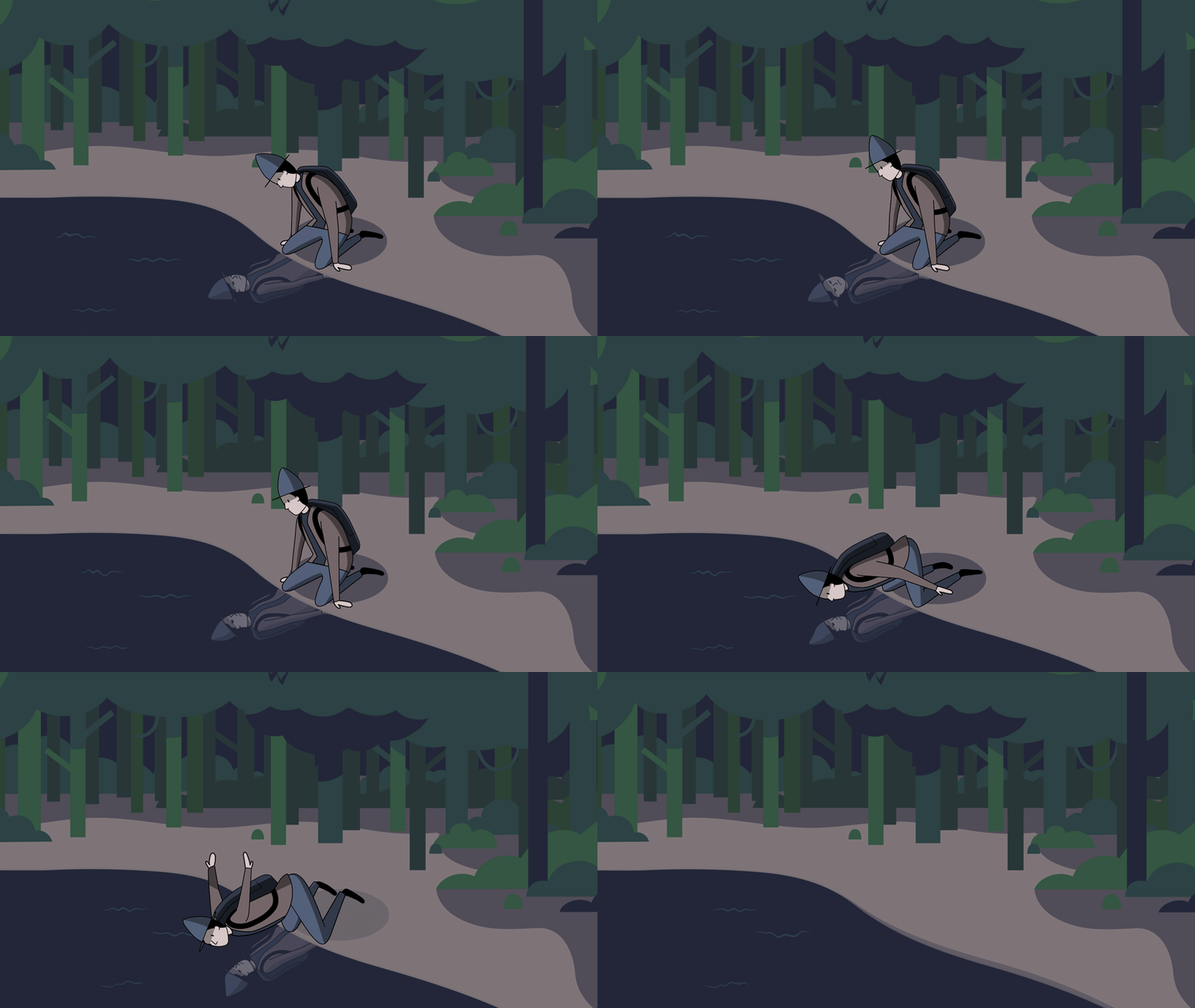
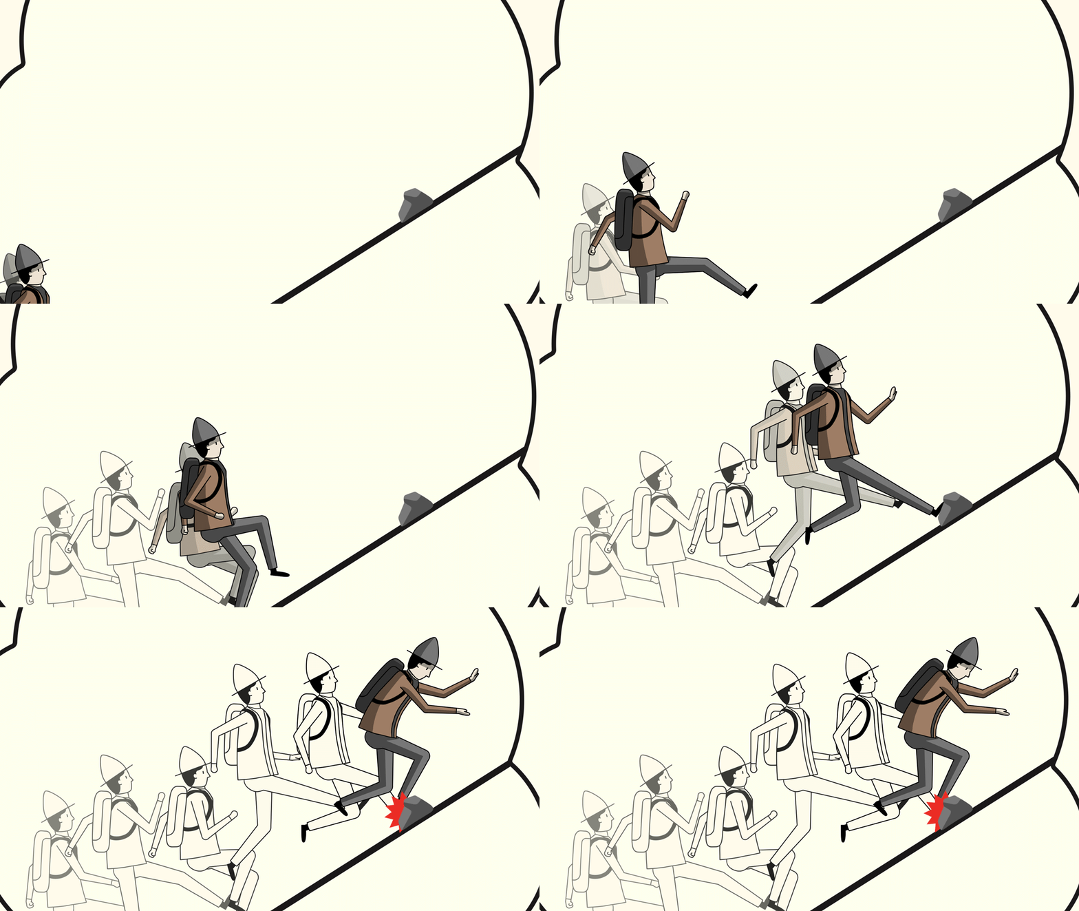
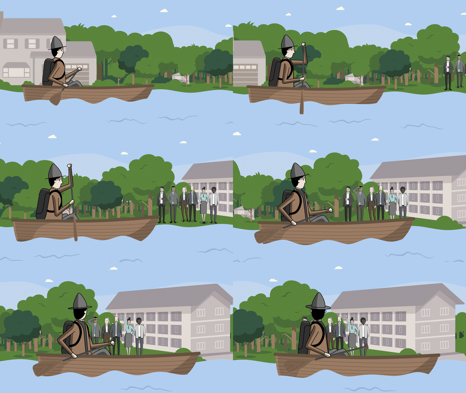
As the world of Principles built shot by shot, episode by episode, the final products began to materialize with the inclusion of Ray’s voice over and Jeremy Turner and his team of sound wizards (Tim Nielsen, Owen O’Neil) added their artistry to make them feel complete. The result has been a powerful legacy piece that’s instantly found an following on YouTube. Thanks to the wonderful shepherding from Ray and his team (Jeff Taylor, Christina Peabody, Mark Kirby), the team of Mark Del Lima and Hortense Desodt from IDEO (amongst others), and our own hugely talented illustration, design, and animation teams (thank you!), we were able to deliver an ambitious, one-of-a-kind solution that delivers a message that’s been resonating with a global audience that grows every day.
