“As always, T&F went above and beyond as a true collaborative partner. Their passion for their craft comes through in every stage of a project, from initial briefing, to elaborate boards and animatics, through final sophisticated animations. They are flexible and thoughtful when addressing feedback, always striving to deliver the best possible creative. And this time, the result was a beautiful, emotional, and ultimately hopeful piece that truly encapsulates this powerful series.”
– Michelle Weaver, Creative Director, A&E Brand Creative
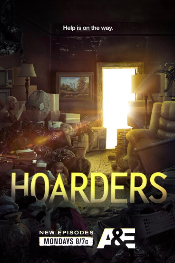
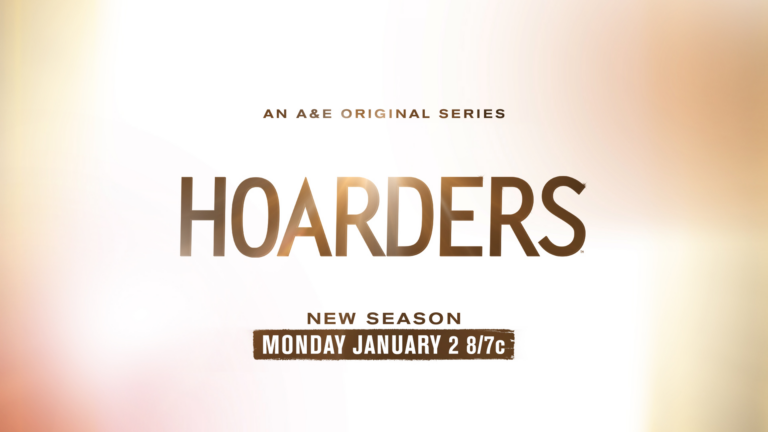
Hoarders is an American documentary reality television series that debuted on A&E in 2009. For the Season 14 premiere, our great friends at A&E turned to Thornberg & Forester to craft a resonating promo package for broadcast and social channels.
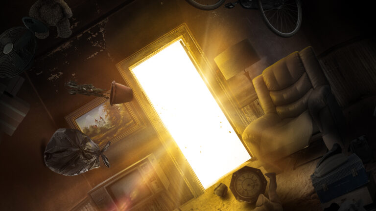
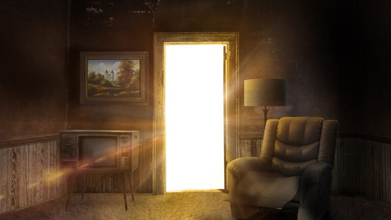
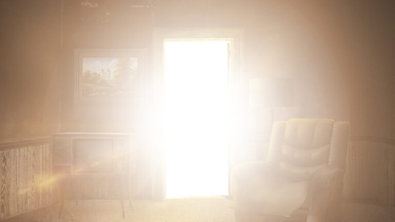
The team at A&E developed striking key art last year for the series and based it on the concept of being ‘buried’; playing off the idea of personal emotions and literal things that accumulate over time, causing people to feel weighed down, trapped, buried. The key art also has a sign of hope, represented by a glowing warm light.
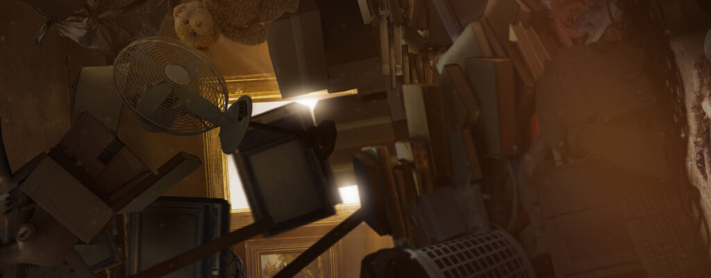
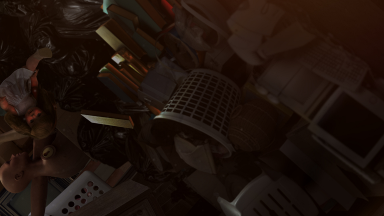
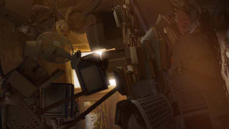
Our task to leverage this concept was two-fold; one, present the reality of being trapped and two, present the process and results of what the show is all about, lifting weight and trauma from someone’s life. We pitched the idea to start with a densely packed room of stuff, and have items fall down, one item at a time. The camera then begins to slowly rotate 180˚ to give the illusion of weight and trauma literally being lifted from someone’s life. As the room becomes less dense, ambient, warm light illuminates the space from an open door. The room also becomes clean as carpet stains and dirt are whisked away for final reveal.
We secured assets from the existing key art and designed a handsome set of frames that would tell our :30 story. We embraced the temperature and tone of the color palette and built a sense of drama and hope with volumetric lighting.
As our design frames defined look and feel, our team also built a rough animatic, informed by a bite-driven audio edit from A&E. The animatic provided proof of concept to validate the general idea, and helped to inform general timings and pacing.

Crafting this visual narrative was a technical challenge. In all, spot assembly was driven by six main components: room construction, room population, camera move, animation timings, texture and lighting, and grade and finish.
/ Room Construction
We constructed a 3D living room based on the 2D key art. The room consists of three wainscoted walls (one with a doorway), ceiling and carpeted floor.
/ Room Population
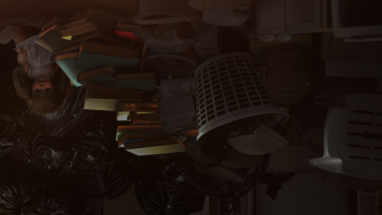
Though we had several items provided from the key art, we needed a great deal more to populate the dimensional space of the living room. In all, we secured hundreds of elements, deconstructed them, and applied a weathered treatment to them all.
/ Camera Move
Knowing total running time for the hero spot would be :30, we did several tests to land on what the speed of the camera should be. This also helped to determine the literal depth of the living room in 3D-space, and resultingly, defined the amount of items we actually needed to fill the room with.
/ Animation Timings
The big idea was to start with a wall of hoarded items, and over time, the hoard is reduced as items fall (then lift) away from the life of a hoarder. With hundreds of elements to cue timings for, our team work diligently to find the perfect cadence and to ultimately land on the inspiring image of a cleaned up living room. We also added secondary animation to several books which fan open as they fall through frame.
/ Texture & Lighting
We spared no detail and illustrated layers of texture to the room and all objects inside it. We also added layers of dirt, dust and stains to the carpet, which we see vanish as we land on the final image.
/ Grade & Finish
One of our primary goals was to match the qualities of the key art. Also paramount was to visually equalize all disparate objects which were secured from many different sources by way of hue, saturation and levels of contrast.
Our production team worked at a master size of 1920×1920 to account for all three deliverables – HD, vertical, and square. :20 and :15 cutdowns for each deliverable were also built from the same master file.