“From the earliest discussions about goals and intentions, through building mood boards and shaping ideas, all the way to design iterations and execution the T&F team operated like an extension of our internal E! Creative Department rather than a separate group. Our work together was cohesive and collaborative, T&F took sometimes-difficult feedback in stride and was able to help us pivot through the approval process on a lengthy assignment.”
– Jonah Birns, Creative Director, NBCU TV & Streaming
“As always, T&F delivered an especially user-friendly toolkit—one that flexes as necessary to accommodate a bespoke aesthetic for unique IP while otherwise remaining true to the master brand. By clearly baking both the rules and the ways in which we can break those rules into the style guide, T&F set our designers up for repeat success across all platforms.”
– Rob Edmond, Creative Director, NBCU TV & Streaming
From legendary red carpets to iconic Hollywood families, E! has long been a fan’s first stop for the latest in pop culture and celebrity access. But with the arrival of social media, fans have access to all celebrities at all times. Celebrities and fans are more connected than ever, and the conversation is evolving – opening up to new voices and new perspectives.
E! used to be gatekeepers – letting fans know what was hot and what was not, embracing exclusivity, and chasing trends. Now E! is using their powers to amplify more voices than ever before, inviting everyone to speak their truth without judgment. Whether the vibe is going out or staying in, E! curates an experience that allows fans to keep up without pressure and bliss out with the pop culture they love.
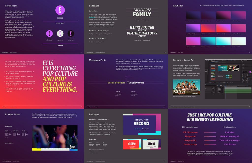
Sorry but not sorry, the E! logo is a classic – unchanged since 2012 and barely changed since 1990 when the network was launched. Once a logo becomes a true icon, the instinct is often to minimize it, allowing the brand to take a backseat to top-tier content (like the Kardashians). But E! is entering a new era – less judgmental, and more inclusive.
As shown in the examples above, the E! logo acts as a strong unifying element across our hero endpage system. E! brings people together, and their logo (a literal exclamation point) is the perfect expression of where E! is headed next. This new brand gives the logo a stronger presence throughout all expressions of the brand, reinforcing that E! is the heart of pop culture fandom. Endpages feel consistent across multiple colorways, allowing E! to use their core brand palette or to develop custom palettes for top-tier properties.
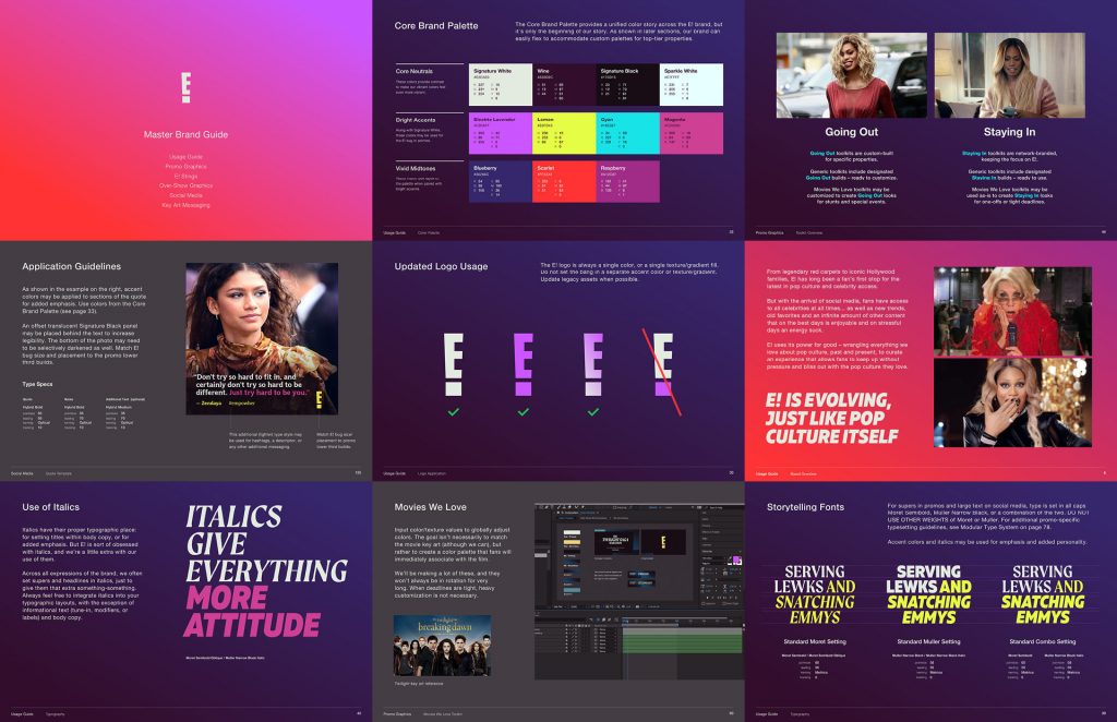
E! isn’t just one thing – she’s a rainbow, darling. The new brand system was designed for versatility, and to differentiate and play well with sister brands in the NBCU family. Working with the E! team, we developed detailed specs for our bold new typographic system and color palette, as well as guidelines for their editorial voice and tone. Across every expression of the new E! brand, we’re all about these five core principles:
1. Be a BFF – We use our pop culture powers for good, sharing our access and inviting every fan to join the conversation. We provide a valuable service to pop culture fans who love to wind down with the best of pop culture without the pressure of having to keep up.
2. Be Open – Pop culture is no longer dictated by a select few from LA or NY. In fact, the magic of today’s pop culture is that it can come from anyone, anywhere, at any time.
3. Be Fluent – Different fandoms speak differently amongst themselves – and no judgments here, it’s all good with us. Be as knowledgeable and passionate about pop culture content as true fans are and move between fandoms with ease.
4. Be current and nostalgic at the same time – Whenever possible, connect the dots between pop culture’s past and present. That way fans of all ages can discover something new, and above all, feel seen.
5. Be a fan first – Never be afraid to wear your fan heart on your sleeve. The more authentic and knowledgeable you are about a pop culture property, the more powerful the brand expression.
Typographic messaging plays a key role in E!’s new brand, empowering celebrities and fans alike to speak their authentic truth. We developed a typographic system that has E! covered whether they’re serving red carpet glamor, a wild game night at home, or anything in-between.
For all top-level messaging, E! speaks boldly and confidently in one of two fonts: Moret or Muller Narrow. It’s a classic serif-and-sans-serif pairing – Moret providing the classic sheen, Muller narrow providing the modern impact. And of course, we also developed a complementary system for setting smaller informational text and tune-in.
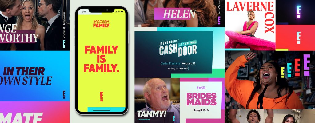
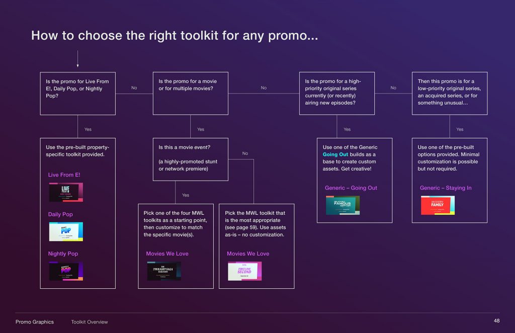
Our promo graphics toolkits include going out looks and staying in looks. It’s a vibe (or two vibes), and it’s all about giving E! the tools to cover any promotional needs that arise, all while keeping everything aligned with our core brand principles.
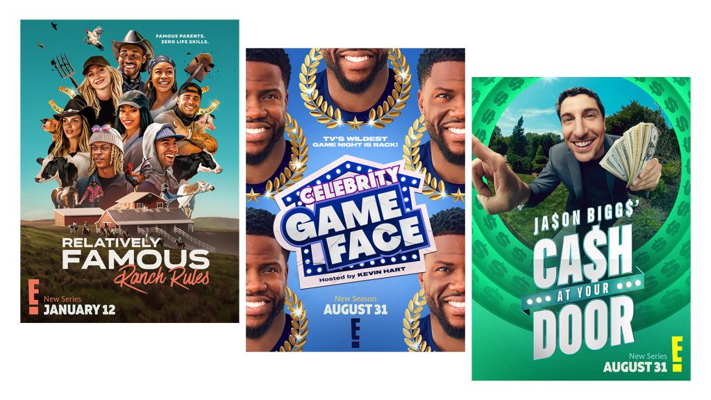
Going out looks are customized for specific properties, while staying in looks are ready to apply right out-of-the-box. As demonstrated by the examples above, the result is an incredibly flexible promo graphics system that can adapt to any purpose while maintaining visual consistency. We’ve empowered E! to create custom graphics tailored to original content, or branded graphics that speak to all E! fans.
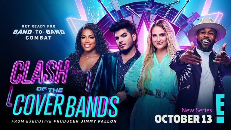
Staying in is represented in the Modern Family promo above. Going out is exemplified below in the E! original series Relatively Famous Ranch Rules and If We’re Being Honest with Laverne Cox.
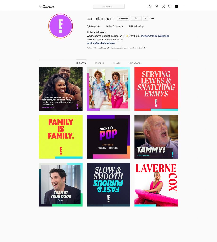
And our promo toolkit system doesn’t just adapt to content-specific needs – it also adapts to different aspect ratios. All toolkits were developed so that the same promo can be made not only in 16:9 HD, but also in square and vertical formats.
This flexibility allows E! to generate promotional content for any platform, from social media to old school linear television – and everything in-between. E! can connect with fans in their own digital communities, on their own terms.
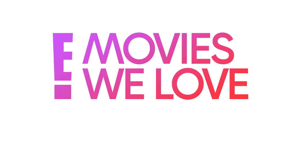
This rebrand isn’t a small shift for E! – it’s a big, bold statement. To fully revolutionize the E! brand, we left no detail untouched. Thornberg worked with the E! creative team to develop an updated logo for Movies We Love, striking a balance between retro fandom and contemporary style.
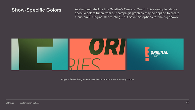
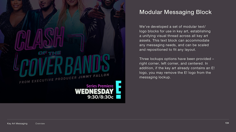
We also developed two modular type lockup systems. Our updated logo and animation system for E!’s Original Series sting reflects the same spirit as our promo package – she’s ready for anything. And to cover all of E!’s key art needs, our modular messaging block system keeps things consistent without relying on an overly-complex set of usage guidelines.
It’s not just about picking cool fonts and colors and empowering the production team with toolkits to meet any need. To ensure that E! delivers on its commitment to raising diverse voices wherever the brand lives, we developed a thorough and clear set of new application guidelines.
From social to streaming, on-air to out-of-house, we’ve developed a system to maintain consistency. Our usage guide covers everything from keeping the tone of voice consistent across all messaging, to keeping the type and colors on point. With these tools, we’ve given E! the confidence to walk proudly into a new era, and we can’t wait to see where they go from here.