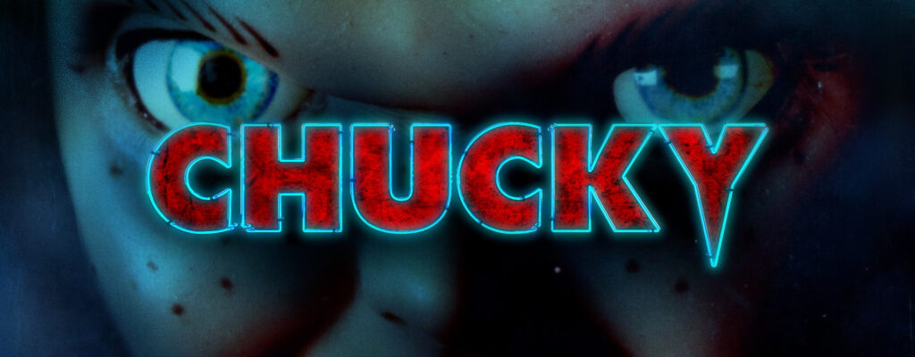

We were absolutely thrilled to be invited to create a promo graphics package for the third season of this iconic horror franchise. As the streaming landscape evolves, networks are continually presented with new promotional challenges. Content doesn’t have a single home, and brand choices aren’t as straightforward as they used to be. Chucky airs on both USA and SYFY, and streams on Peacock. The franchise must retain a voice of its own, while also feeling at home alongside three different network brands.
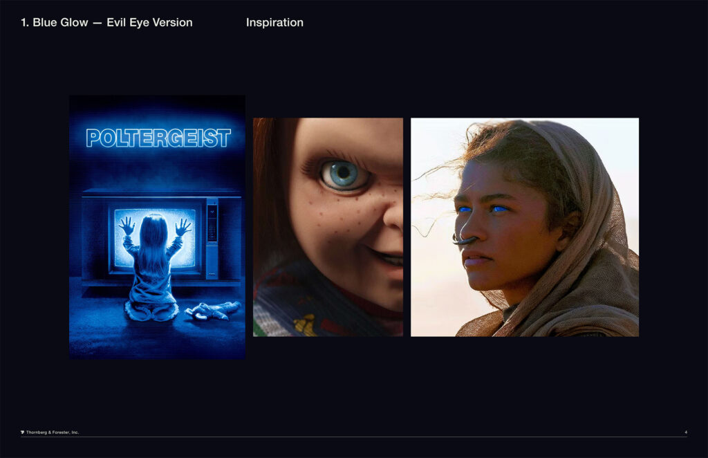
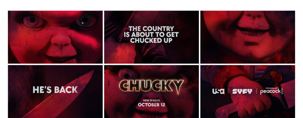
This season, Chucky wreaks havoc in the White House! We leveraged his iconic, corpse-blue eyes and bathed all scenes in an eerie blue glow. To draw sharp contrast, graphics and typography are rendered in a demonic blood-red. This color pairing also serves as a subtle nod to the red-white-and-blue of the American flag without leaning too heavily into political imagery – Chucky is the real star, and should be the primary focus.
In Chucky’s unending thirst for power, Season 3 now sees Chucky ensconced with the most powerful family in the world – America’s First Family, inside the infamous walls of the White House. This setting provides a lot of interesting iconography to draw from, in addition to the major running themes for the series, and for the character himself.
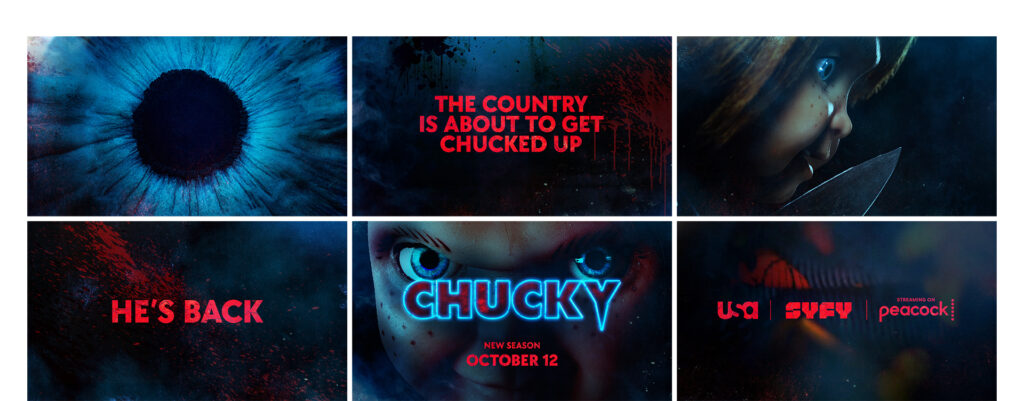
Chucky embraces the over-the-top world of modern horror, following the lead of shows such as American Horror Story. It’s truly frightening, but the horror comes with a heavy dose of humor and pop culture references – taking the scares to new and extreme places. And of course, Chucky himself is a true icon, a villain who has both horrified and delighted fans since his cinematic debut in 1988. With so many promising themes to play with, we conducted a thorough design exploration to find the ideal solution – the winning direction is above. Before we share our other design contenders, check out this sweet Jennifer Tilly cut with our graphics done by the amazing team at NBCU.
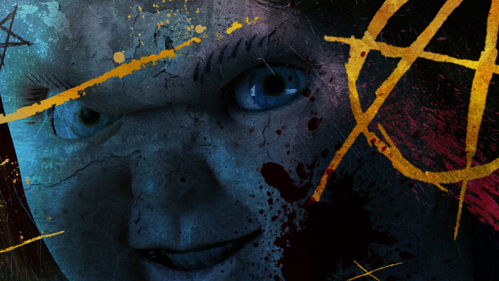
We explored several ideas referencing Washington D.C. and the American political system. This included putting interesting twists on classic patriotic imagery, such as the idea of Chucky’s Presidential campaign (running on a platform of sheer chaos and anarchy), and the “slashed” direction above, playing off of the real, existential horror of American political divides.
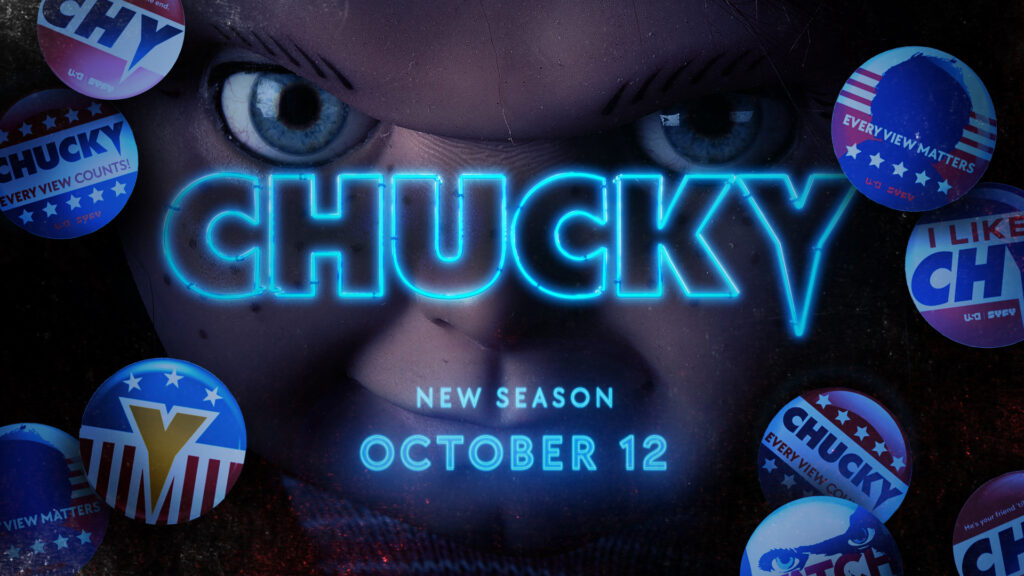
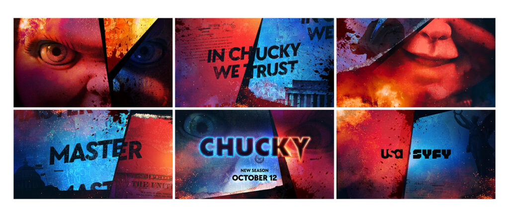
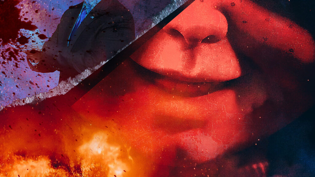
In the end, these treatments felt too heavy on politics and didn’t quite deliver enough Chucky…after all, he is a horror icon, and the show’s main draw.
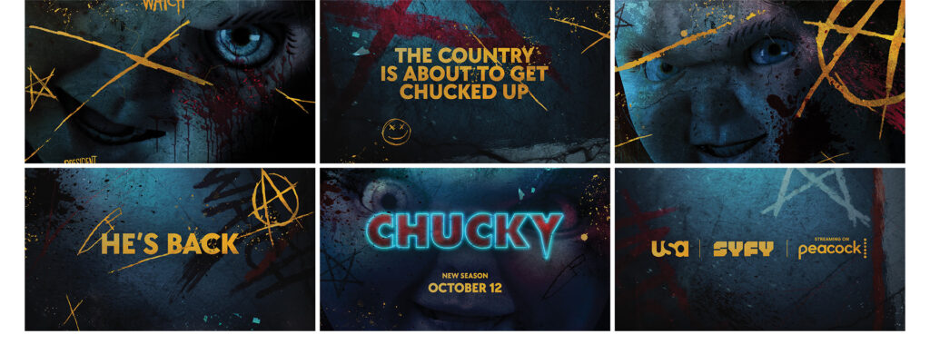
Our treatments were designed with the previous two seasons in mind – as well as the extended world of Chucky and the rich fandom universe that comes with it. Previous seasons leaned on a palette of primary colors (red, yellow, and blue) to reinforce that Chucky is a serial-killer-possessed child’s toy with a nod to kindergarten-esque primary colors. We ultimately dropped yellow this season, but still wanted to ensure a clear visual throughline for the series as a whole.
For additional brand consistency, we kept the font – TT Chocolates – the same as previous seasons, but we added some new typesetting twists. The typeface is evocative of the original Child’s Play logo, while also tapping into a larger tradition of round geometric type in horror graphics (the Halloween franchise, HBO’s Lovecraft Country).
At his core Chucky is an anarchist, and chaos delights him. He’s interested in the mess of our political system – the scandals, the lies, the power grabs. Also, his weapon of choice is a butcher knife which he uses to dismember people. He seeks to divide us, both metaphorically AND literally. Our graphics package is optimized to convey Chucky’s twisted worldview in a compelling manner.
Modern promotional cycles demand flexibility, as promotional needs and goals can now change seemingly at any minute. To meet these needs, we created a system that is highly customizable. Title cards are the backbone of the package – providing quick-hit messaging and storytelling to really drive the narrative home. Knowing this, we developed five different backplate options showcasing the full scope of chucky’s evil vision for America.
Our graphics give the content an ominous tone, and provide even more Chucky – because fans can never get enough of their favorite killer doll. Use of the eye frames the story through the lens of Chucky, giving us a window into his demented mind.
Our promos and marketing assets need to appear across a wide variety of platforms, so we also maximized our toolkit for output in multiple aspect ratios – including square, vertical, HD, and 4×5. Graphics can be easily edited and output in any format needed. No matter where or how you consume content, Chucky is coming for you…
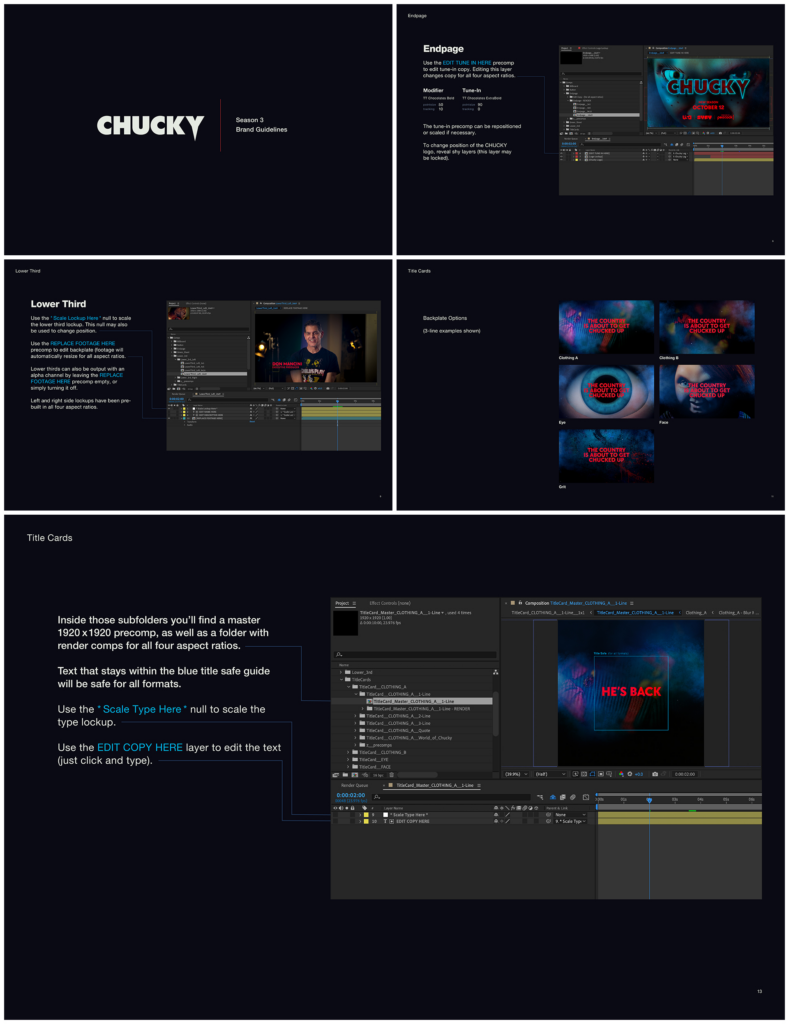
A promo package is only as strong as it is executable on the client end. With faster and faster turnaround times to navigate, we needed to ensure not only that we provided a clear set of application guidelines, but that these guidelines were easy to digest and internalize – even when the team is in a rush.
We used previous seasons’ toolkits as a jumping-off point, to ensure familiarity. Then, we streamlined and updated them to make application even more straightforward. All deliverables were ready to go out-of-the-box, and were optimized for additional customization, if necessary. This package was designed to live beyond traditional promos and trailers. In addition to an extensive title card system, the full package included cross-network promotional assets and sponsor billboards, as well as deliverables for extras and behind-the-scenes content.
