
Since 2017, Thornberg & Forester has partnered with Spectrum on a diverse array of projects from cross-channel campaigns and co-branded spots to nationwide print and digital out-of-home campaigns, master brand evolutions and dynamic broadcast toolkits.
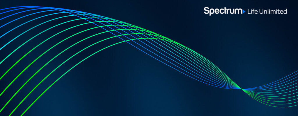
Most recently, we tackled a reimagination of Spectrum’s top-level brand assets – the core DNA of the brand for all visual communication. The goal was to create a compelling visual device that would live alongside, and enhance, the presentation of the Spectrum logomark and support the new visual identity tag, ‘Life Unlimited’. And of course, the design system had to exhibit a strong connection to Spectrum’s existing branding, to provide a consistent throughline for their customer base.
Each of our proposed design treatments embraced Spectrum’s relentless commitment to innovation in different ways – from reinterpreting existing brand assets to crafting, refining and developing the select, which was was ultimately coined, ‘connectivity current’.
In the end, simplicity prevailed. A minimal approach with clean lines featuring a color gradient fill was the most effective visual motif, remaining recognizable across a broad range of applications. The ‘connectivity current’ would mostly appear over a deep blue backplate, boosting its vivid colors. The current is designed to work with the ‘Life Unlimited’ tagline, extending beyond the bounds of the frame to convey the idea of limitless connection.
The Spectrum brand has predominantly been blue-forward, but blue is a difficult color to own in the current media landscape. To differentiate Spectrum from these peripheral properties, a vivid green has been added to the mix. This creates separation from competitors while allowing the brand to retain a strong blue presence – bridging the past and the future. Green also adds a depth and richness to the palette that feels new and unexpected.
This new expression of the Spectrum brand initially found life as a visual ID – an all-purpose logo sting. The ID features the ‘connectivity current’ with the vivid green color accent, connecting this new asset to the existing brand in an engaging way. The ID also includes a future-forward sonic created and furnished by amp sound branding.
We created opens (with transition to footage), closes (including a keyable option), and loopable versions. Asset were delivered with and without tagline, and in a wide range of formats to work across all platforms. With this versatile set of logo assets, we enabled Spectrum to immediately incorporate their new brand evolution into all creative assets, bringing their new look to life easily, and with impact.
Deliverables also included a PUPD (Power-Up Power-Down) animation, sans tagline, for mobile phones. In all, we delivered over 40 formats at 15 FPS to cover screen size specifications for a wide variety of mobile phone brands.
The evolved brand is not confined to personal screens. After developing our initial set of logo deliverables, we went about maximizing these assets for large scale application. T&F has created assets for the large lobby screens at Charter Communications Corporate Headquarters before, so we were already familiar with the process of reimagining the brand for this venue – approaching the design more as an architectural installation than as a simple animated graphic.
As shown above, the ‘connectivity current’ becomes living art, twisting gracefully as it fills the massive 6K lobby screens. Motion that feels impactful at small scale can often feel overwhelming when applied to an enormous screen. Slow, graceful motion becomes extremely impactful when applied at large scale, activating the space with a hypnotic beauty. For this application, we were furnished an expanded color palette to integrate into the installation.
In addition to the hero logo sequence, we also developed isolated ‘connectivity current’ loops, and transitional animations. Our transitions were inspired by the work of James Turrell, once again looking to the world of art and architecture rather than branding and advertising. As shown in the example below, the transitional graphics provide a connection to the hero brand in an elegant manner.
The soft launch for ‘Life Unlimited’ also called for a national advertising campaign. We were tasked with crafting animated deliverables that were sprinkled across the country, including one of our favorite media placement destinations, L.A. Live.
We were provided with source photography but quickly found there was not enough ‘image’ per photograph for simple camera moves to happen. Our team used AI to considerably expand the width and height of each photograph, while maintaining the fidelity and character of each image.

Our journey to the clean and simple solution above included many stops for consideration along the way. We love minimalism, but we never default to a simple solution without exploring the full range of creative possibilities. When creating an evolution of an existing brand, there is always a danger of pushing things too far, compromising recognizability and brand equity. At the same time, if you’re afraid to shake things up, the end result can be underwhelming. The best way to discover where the line is between too much and not enough, is through informed and strategic exploration.
Our creative discovery phase pushed the boundaries of light, reflection, color, energy, and connectivity. Ultimately, the current-inspired direction is what stuck most and became the foundation for Spectrum’s ‘connectivity current’.
Special thanks to our great friends at Spectrum for your continued partnership and support.