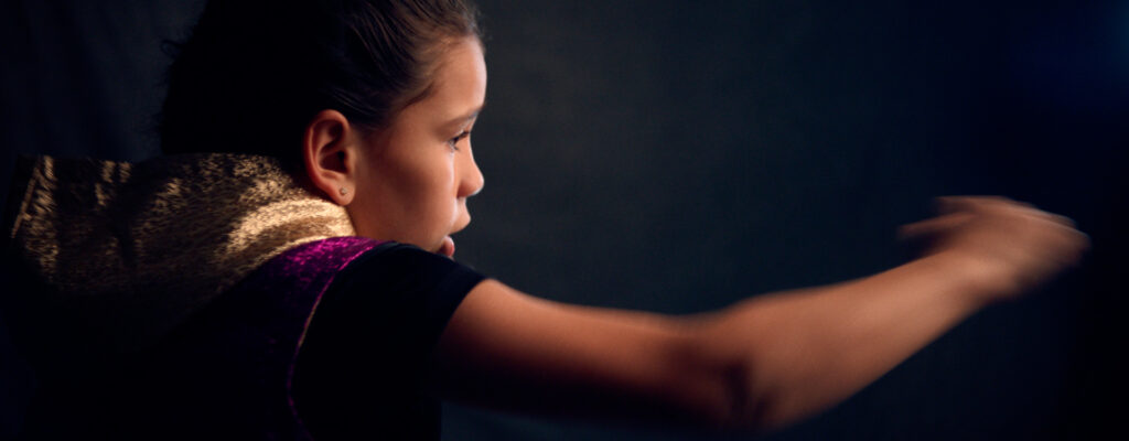

Jesselyn Silva, a 15-year-old girl from New Jersey, is a 3-time national boxing champion. She has her sights set on becoming the best in boxing. Jesselyn’s father, Pedro, navigates what it means to support his daughter’s dreams in an extremely dangerous sport. As Jesselyn is on the cusp of making the Olympic team, she faces her toughest battle yet…a cancer diagnosis. JessZilla is a coming-of-age story about what it means to be a champion.
Director Emily Sheskin started filming Jesselyn over five years ago. Initially, the film was to be focused on women in combat sports and the inequality of pay. Over time, the film became that and so much more. Emily engaged Joyce N. Ho to craft title design and selected T&F to design and produce a wealth of fullscreen and keyable elements to be sprinkled throughout her amazing film.
To be part of the creation of this incredibly important story is something we will forever cherish. It was an absolute honor to be in Jesselyn and Emily’s corner.
Confidence, determination, strength, and grit are just a few words that begin to describe Jesselyn Silva. The sheer power of her story [and the film too] must inform the look and feel of graphics and typography. Joyce developed a striking, limited color palette of gold, black and white, set titling text in Segment A Key Black and secondary text in Founders Grotesk Mono. The typefaces complement one another and work together beautifully.
There are several sections of the film that required graphic design and animation: main title, intro sequence retrospective, winning montage, age ID’s, cancer prognosis, epilogue, and a host of supers, standalone archivals, and lower thirds.
Emily’s vision was for fullscreen graphics to feel as if they’re part of a personal scrapbook or journal, handmade by Jesselyn. ‘On-brand’ graphics would integrate footage and photography and include simple illustrated elements to add personality, fun, and charm. Ultimately, we designed a textural ecosystem of elements based on aforementioned traits and applied the same degree of care and thinking to motion behavior, further supporting a tactile and tangible feeling.

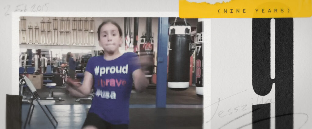
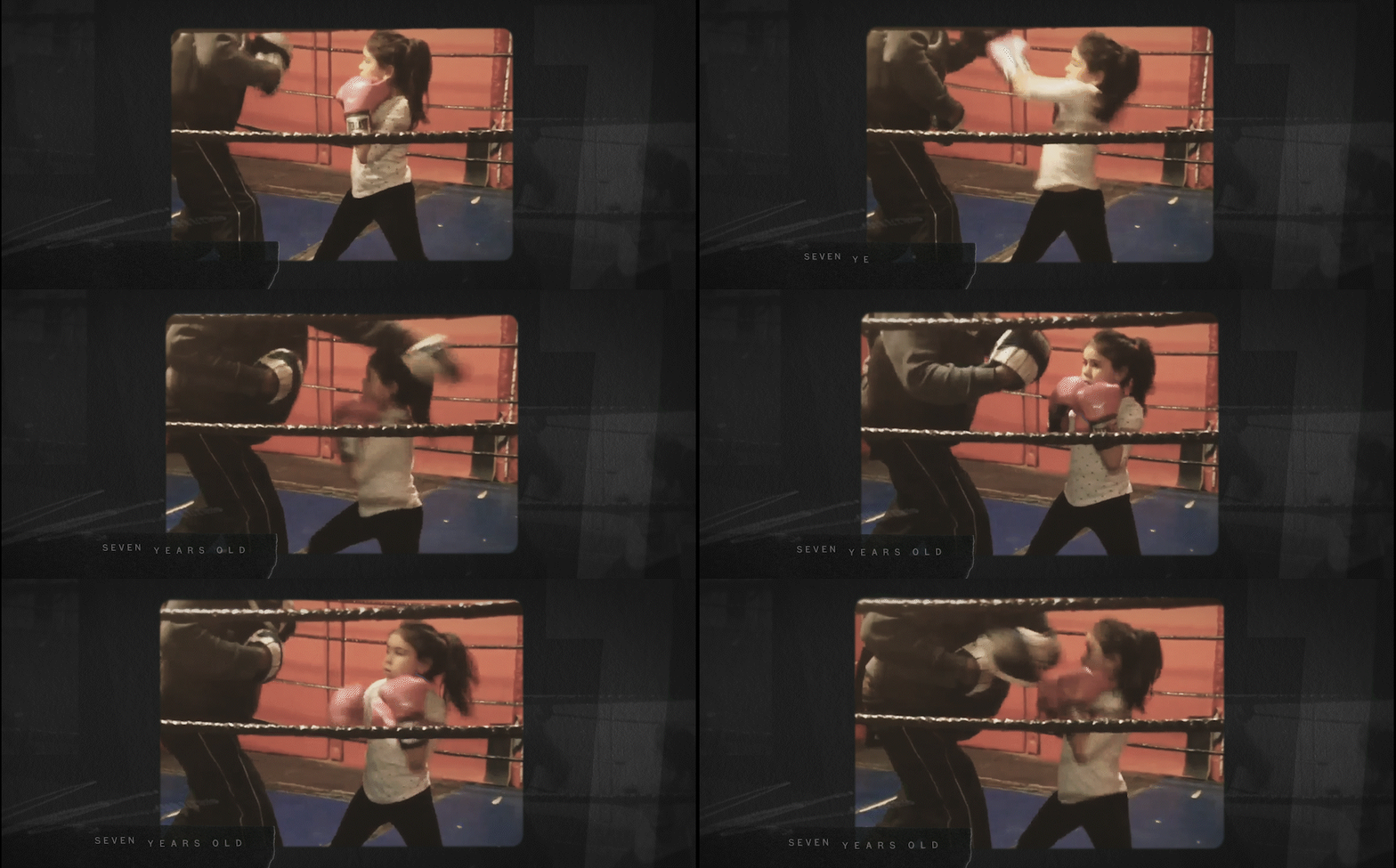
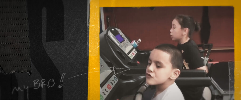
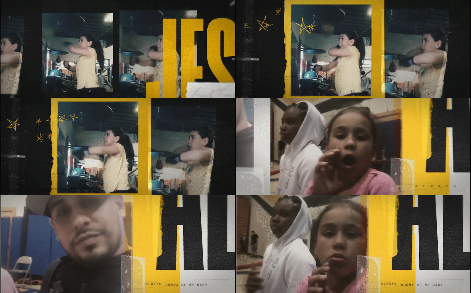
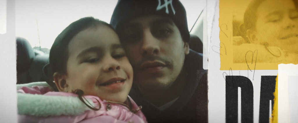
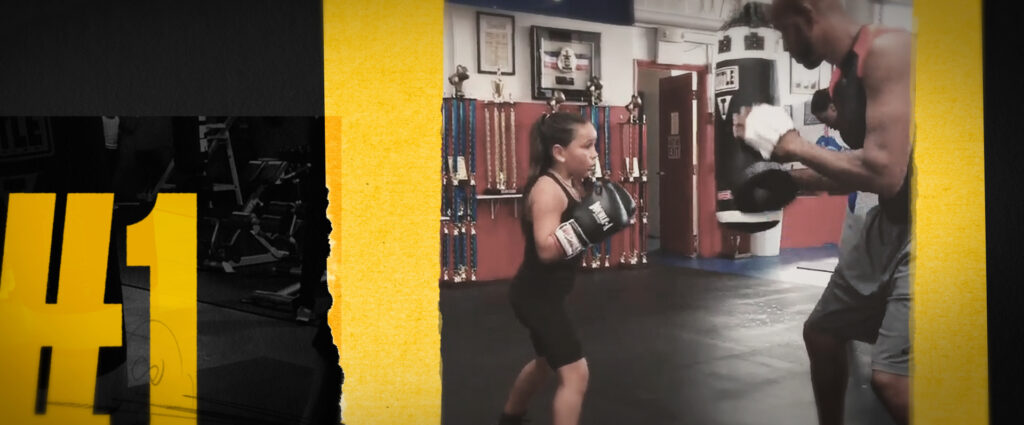
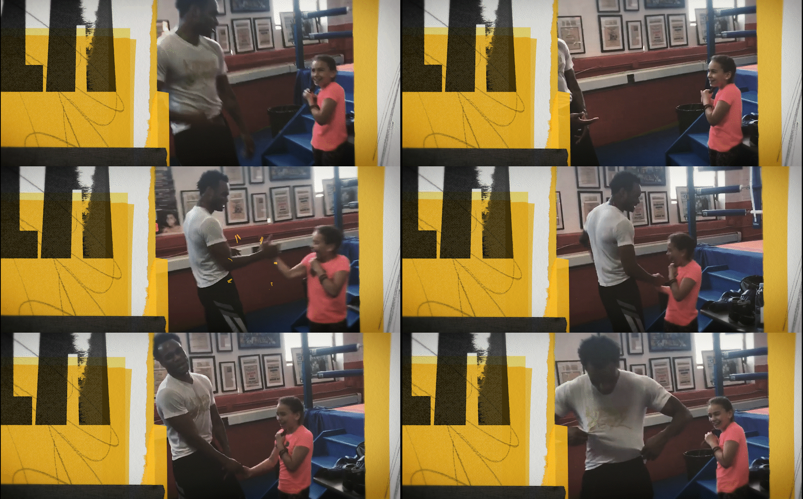
The film begins with a look back, five years ago, to an interview Emily had with Jesselyn and Pedro. This interview becomes a point of reflection to see where everything started for her as a young, up-and-coming boxer. Jesselyn’s retrospective and memories are packaged in stylized, scrapbook form…paper textures, tape, grease pencil, and photo collage combine to launch her story.
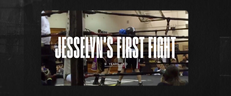
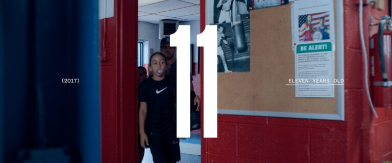
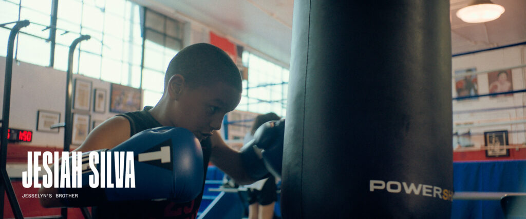
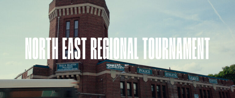
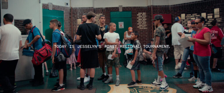
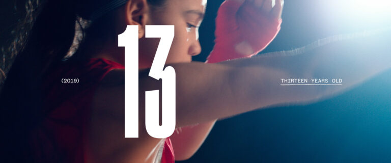
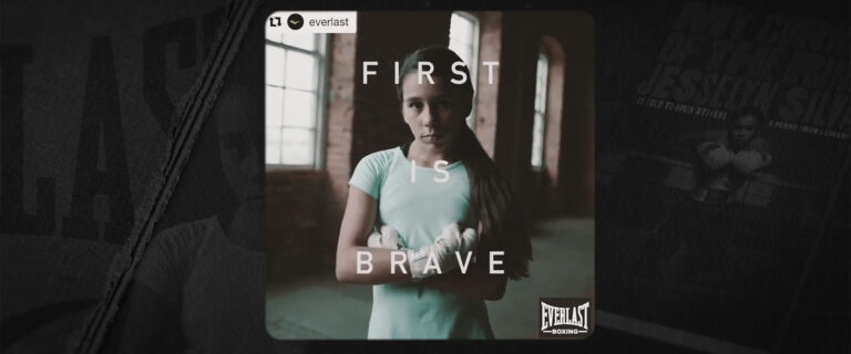
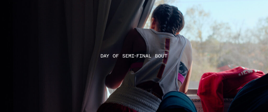
We designed a handsome system of keyable elements (supers, age ID’s, and lower thirds) to live with the same spirit as fullscreen graphics. Text is set to maximize legibility and is animated in the same motion/cut style, but with added nuances (quick shifts in scale, focus, color, and font weight) to deliver a cohesive flow to the visual narrative.
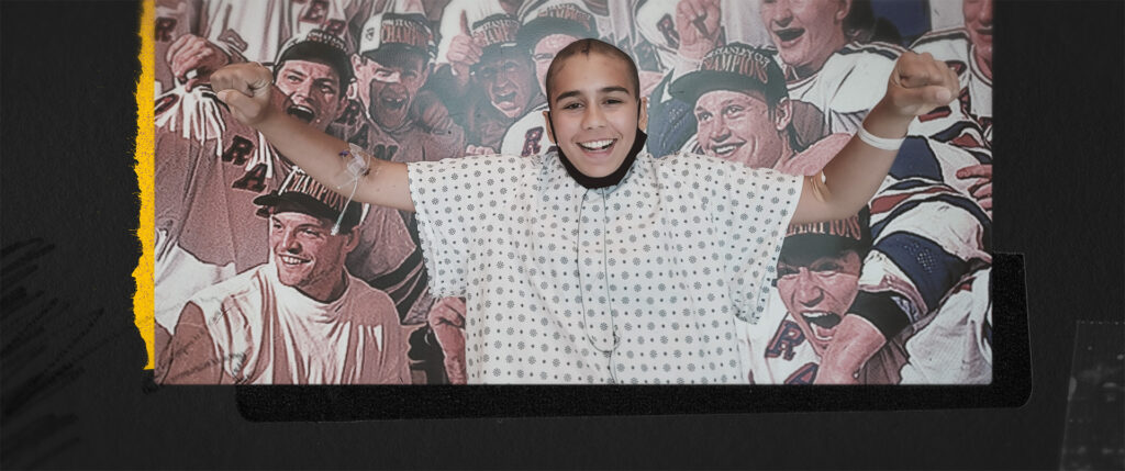
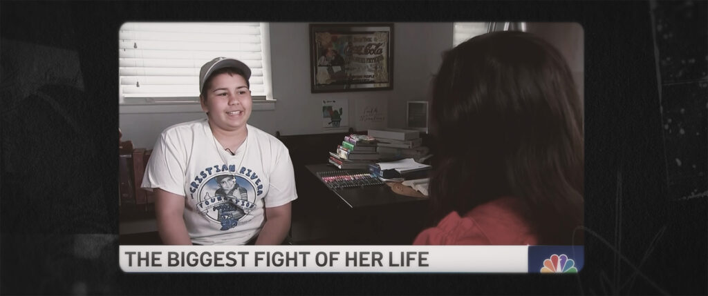
In an effort to protect details of the story, we plan to build out the epilogue section of our case study at a later date. For this early iteration, Emily wanted to make sure we were able to highlight Jesselyn’s love for the boxing community once she’d received her diagnosis.
Jesselyn continues to be an inspiration to many, and we’re looking forward to being able to share more about our creative process surrounding these key moments at the end of the film.
JessZilla had a world premiere at the Big Sky Documentary Film Festival on Sunday, February 19. It will continue to screen at film festivals across the country, seeking distribution. Several festivals will screen the film online, so keep an eye out for virtual festival screenings!
Follow jesszillathefilm on Instagram for the screening updates.