Having partnered with Netflix on several design-based and motion storytelling pieces over the years, we were honored to be selected to align with the Netflix internal innovation team to conceive and produce beta concepts for the evolution of the Netflix user experience.
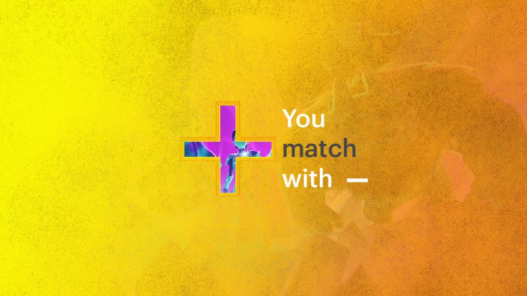
The core of this assignment was to design a set number of treatments and to produce proof of concept, animated templates for short, custom, clip-driven trailers that would ultimately be generated in real-time, and be based upon individual Netflix viewing history. The point was to ‘match’ relevant, suggested Netflix original programming and films [while promoting them] with the likes of individual users, through a universal lens that speaks to Netflix users on a global scale.
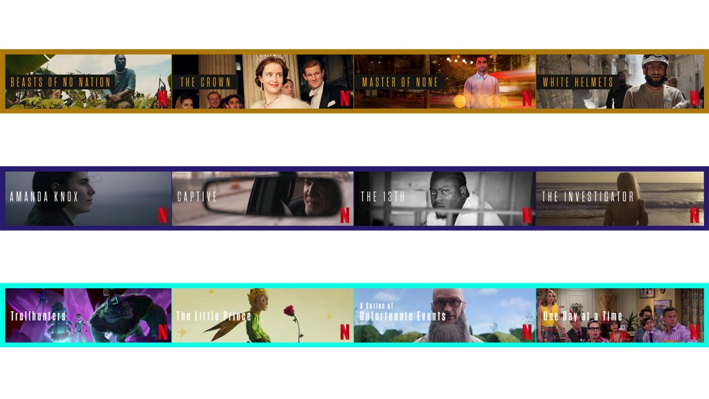
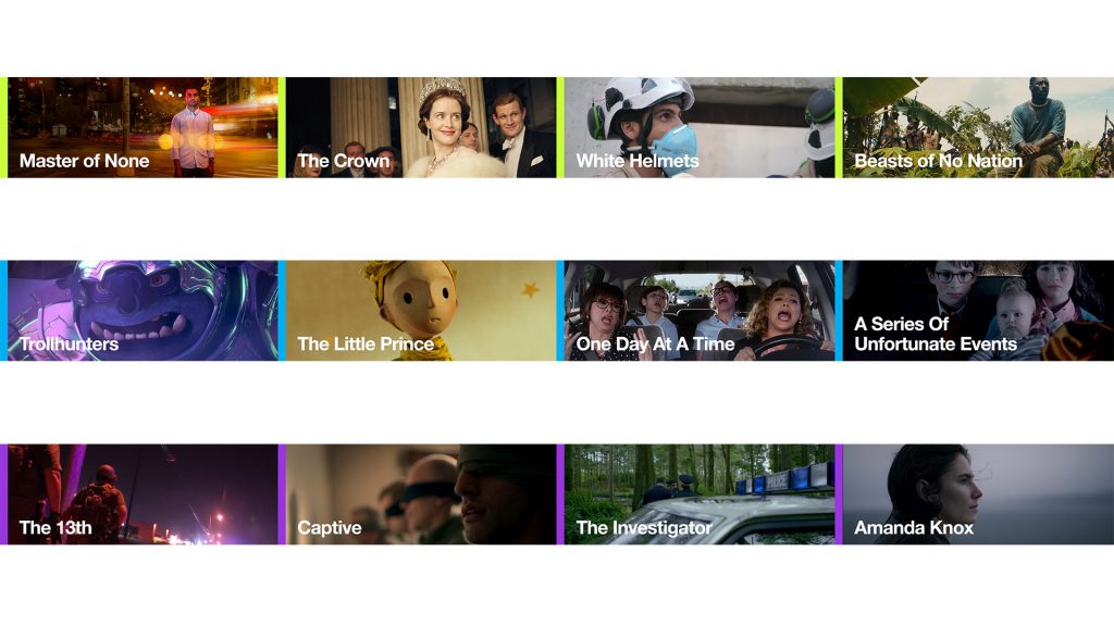
Our process began by deducing how long the custom trailer should be, and by defining how much content one should promote. We landed on a :30 run time that would feature three Netflix ‘matches’. From there, we designed a wide spectrum of solutions that varied in proximity to the Netflix brand. We strategized how Netflix could, editorially and sonically, pique and maintain the attention of viewers, developed thinking to feature hero box art, and innovated a method for how the custom trailers could harmoniously take over the Netflix UI.
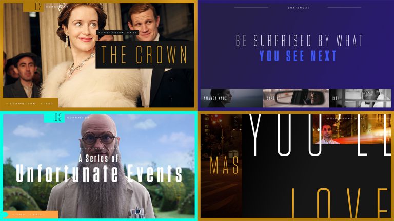
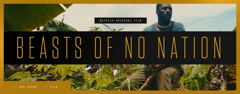
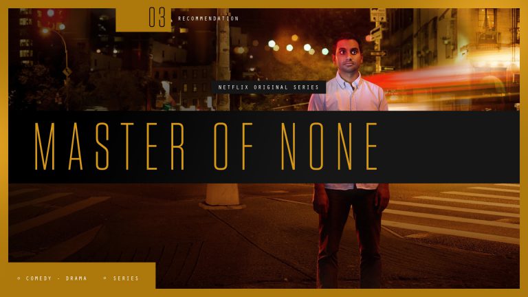
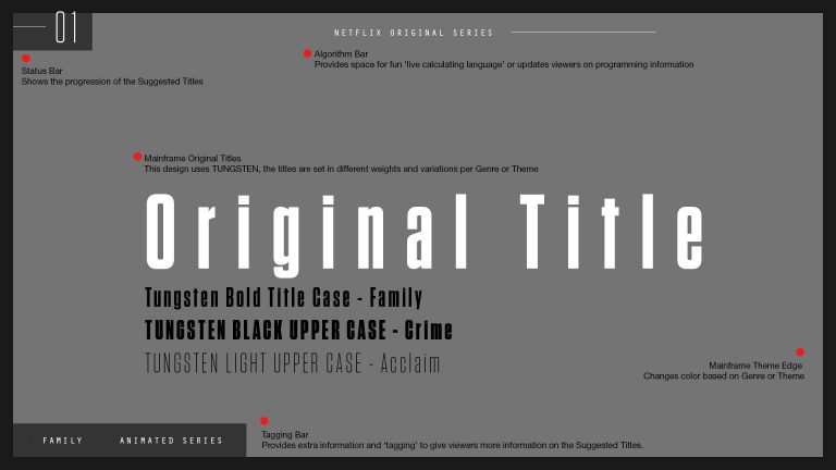
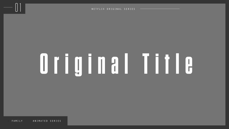
Concept One, entitled ‘Mainframe’, was selected for animation and sound design production. A color-coded framing device would delineate programming genres and provide extra information about the Netflix original series and/or the films that were being presented. The crisp, clean, and bold structure of the design was systematized via an ‘algorithm’ tagging bar, and was coupled with animation behavior inspired by modern digital and tech, indicating to viewers that the trailer is being calculated and generated in real time.
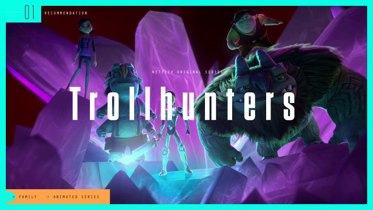
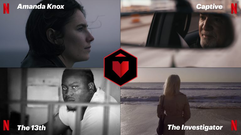
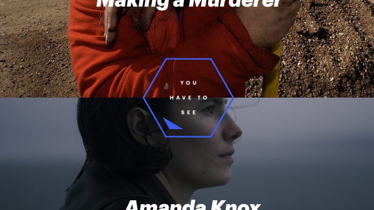
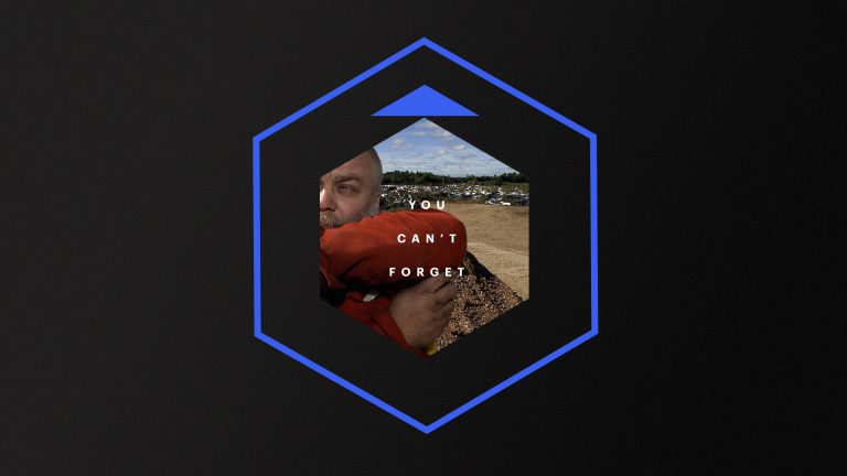
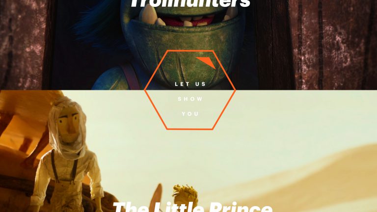
Our second direction was driven by the notion of navigation. A hexagonal ‘compass’ becomes a navigation device to transport viewers through the trailer. The hexagon also becomes a universal form that houses an icon library of on-brand initial caps that represent Netflix programming categories and genres. Additionally, we designed a heart icon as part of the system that would be used as an interactive badge, inviting viewers to ‘like’ their recommendations.
The compass was designed to be led by a directional arrow that would charter direction and pull selected clips from one scene to another.
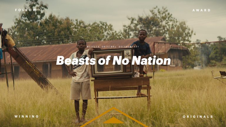
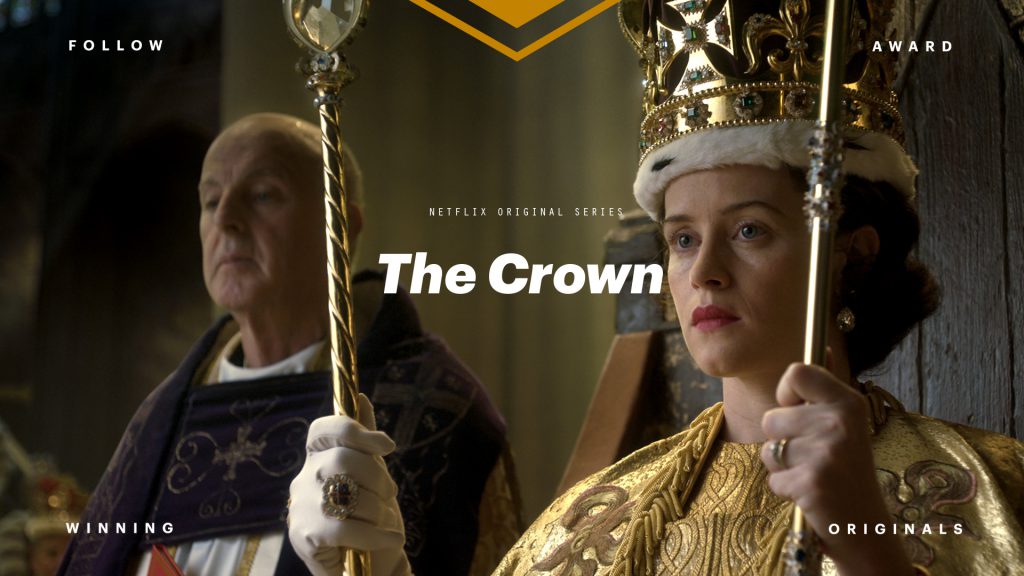
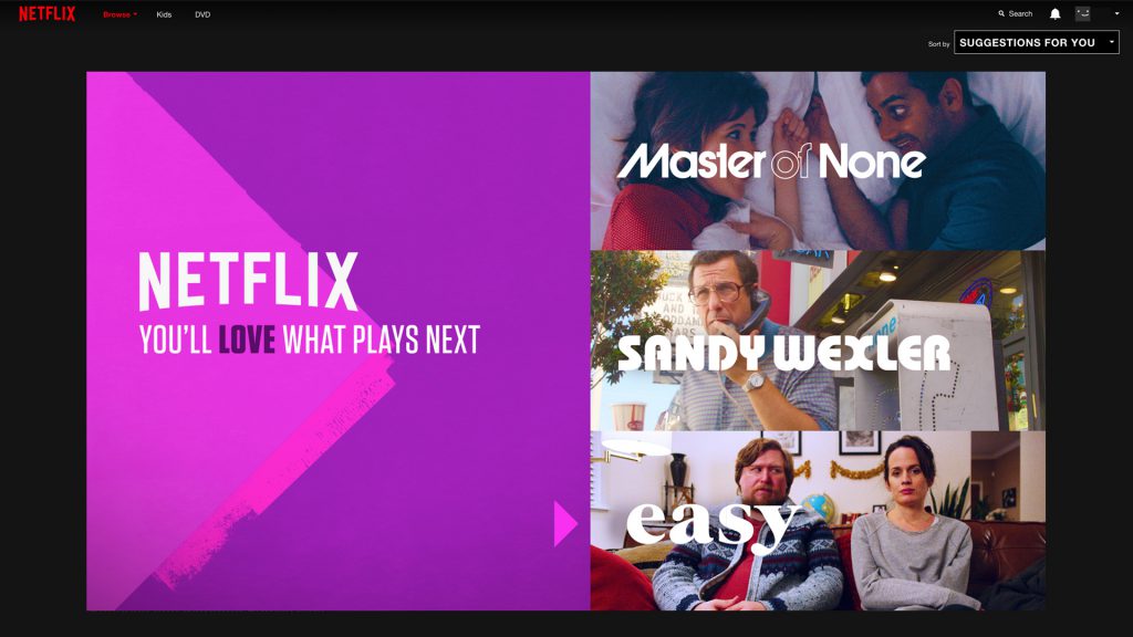
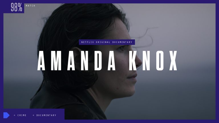
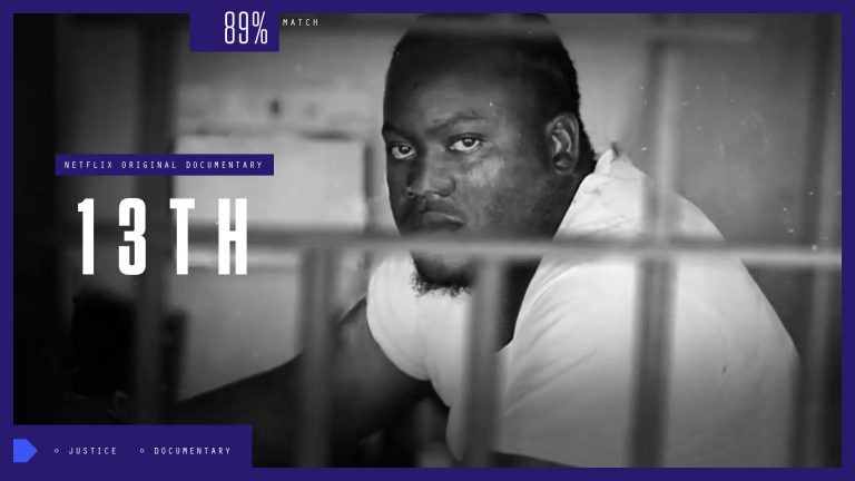
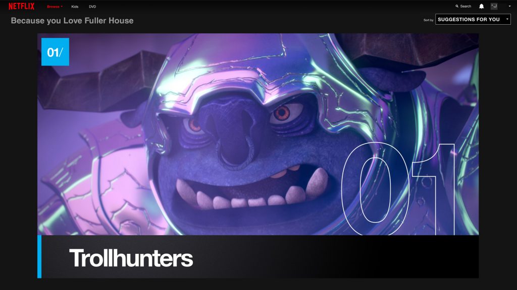
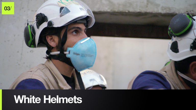
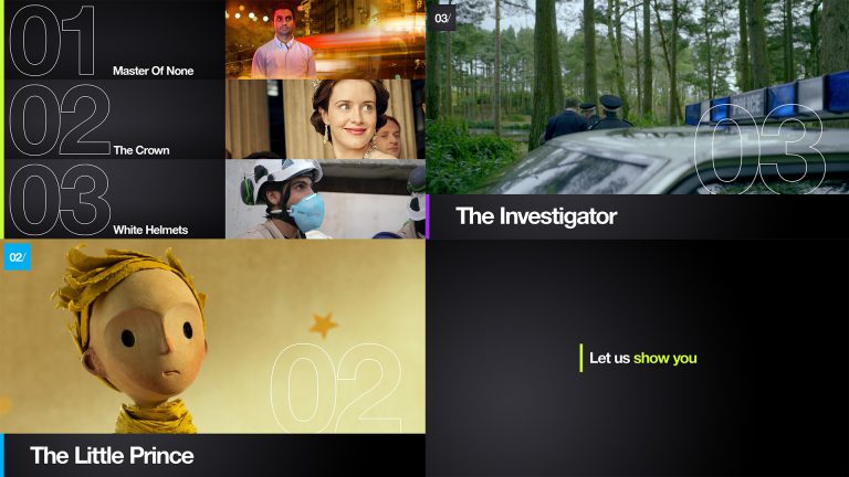
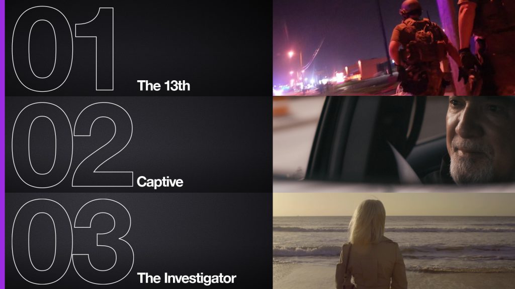
Our third concept was the closest permutation of current Netflix branding. We expanded the palette and created a color-coded [per genre] system of vertical navigation bars that would anchor bold typography lockups, all set cinematically over charcoal and black. The top three matches for the viewer would be typographically tagged in bold fashion, representing a sliding scale of content match percentage.
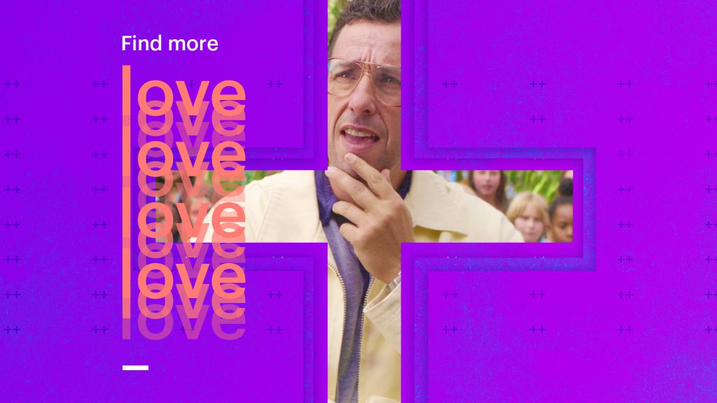
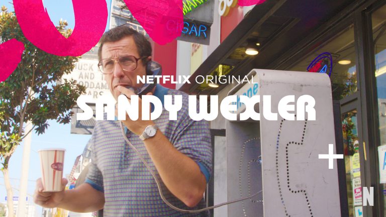
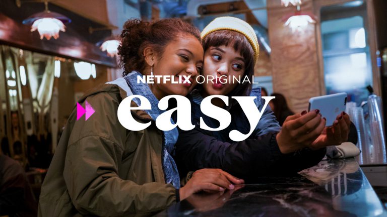
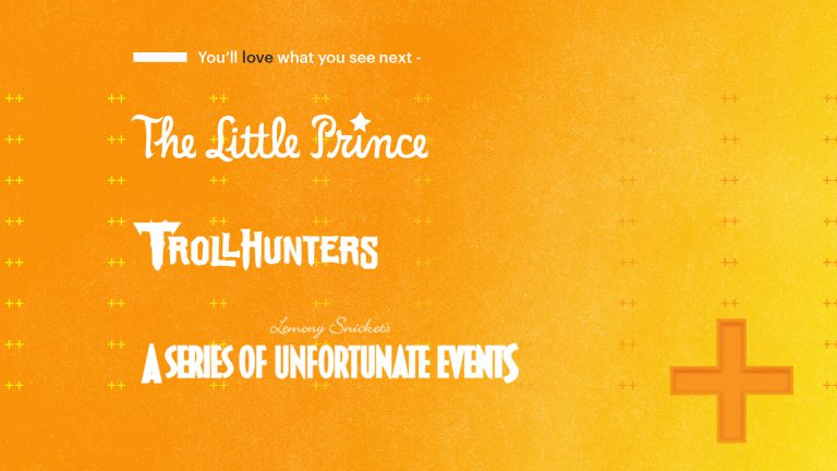
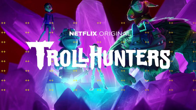
Additionally, we were asked to generate a handful of holiday and event-based design solutions. Should Netflix desire to match holiday-specific programming with viewers around particular holidays [such as Valentines’ Day] or to match and promote a fun playlist for the whole family, our task was to push creative boundaries by entertaining solutions rich with color, texture, and vibrancy. The following frames represent a small glimpse of what we created.